THIS IS IT! DIELINE Awards 2026 Late Entry Deadline Ends Feb 28
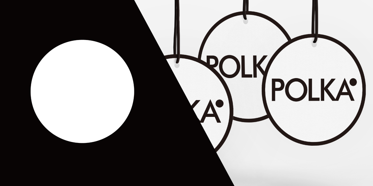
Polka brings a global product selection that is carefully curated to Japan. When creating the identity of Polka, the usage of dots for the identity was utilized in a modern and joyful way which can be seen with each piece of the identity from the business cards, stationary and fun buttons.
“When I created POLKA’s brand image, I expressed the passion, pioneering spirit, and many of interests as POLKA’s identity.”
Get unlimited access to latest industry news, 27,000+ articles and case studies.
Have an account? Sign in


