THIS IS IT! DIELINE Awards 2026 Late Entry Deadline Ends Feb 28
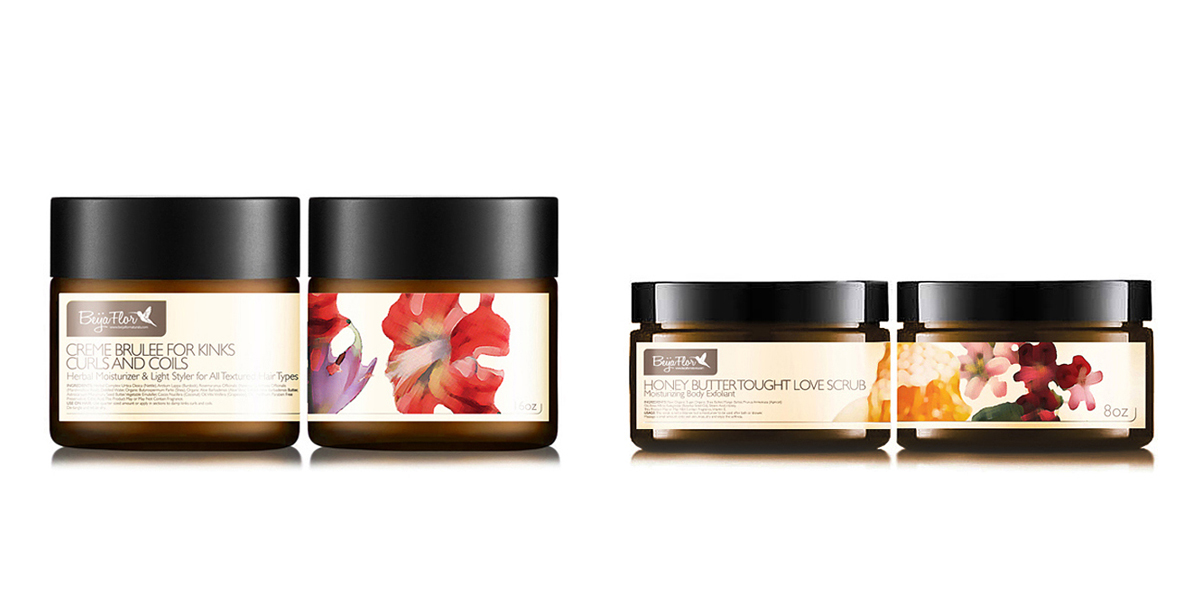
Beija Flor Naturals enlisted ISKRA Creative Agency to brand a new line of organic body care products. ISKRA started with an exploration into hummingbirds, which was selected as a brand icon for the company. The hummingbird made for a perfect symbol because despite being known for beauty, these little birds are some of the toughest creatures in the world, surviving in both snowy landscapes and blazing deserts.
The new organic body products are made from raw vegetable-based ingredients, so the design had to communicate freshness, simplicity, and quality. ISKRA’s challenge was to craft a cohesive story that connected the brand identity with the packaging, the product, and the company’s story.
Get unlimited access to latest industry news, 27,000+ articles and case studies.
Have an account? Sign in


