Foodscross Premium Honey

Published

Filed under


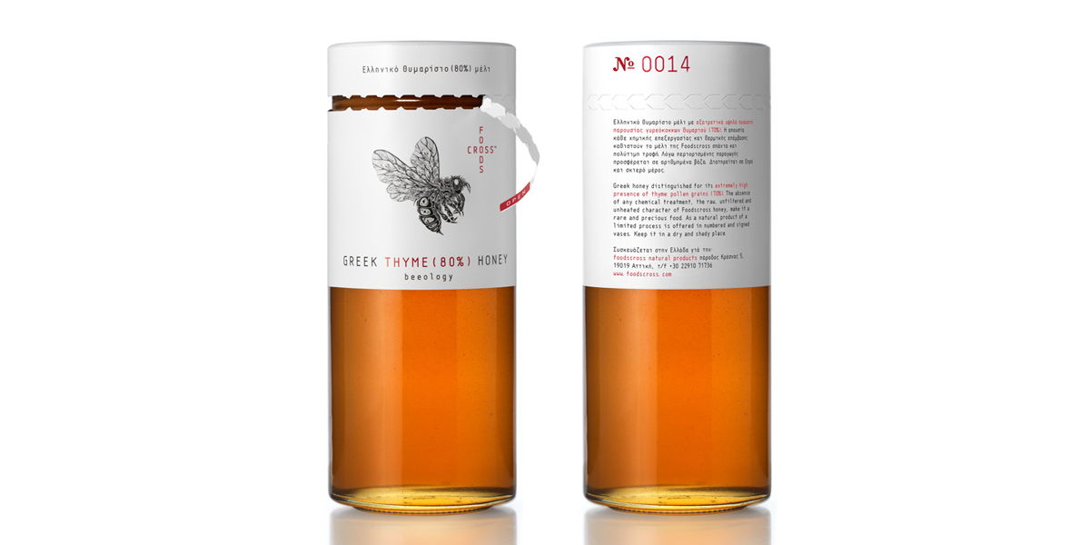
 Mousegraphics brings to the market a new packaging design for honey. With an interactive element of tearing along the perforated edge, Foodcross was designed with statistics in mind. 

“The market for honey is a rising one and as such already filled with a variety of packaging designs. We needed to realize a brand identity able to convey this product’s specific advantage: it’s pure synthesis.”


“This is Greek honey distinguished for its extremely high concentration of thyme pollen grains (80%). A rare, natural product of an eco-conscious process, meant to be offered in numbered and signed vases. We developed the logo design as a careful pairing of cross-shaped lettering (brand name) and the image of a bee, designed for us by the internationally known illustrator Si Scott.”

“The elongated glass vessel we chose is covered on its upper part and topped by the brand identity elements and relevant information, in a way that allows the synthesis specifics and the collector’s data (number) to be clearly visible even when the top is removed. Black, white and red dominate the packaging design in an alternative reference to a pharmaceutical/cosmetics language.”


Designed by Mousegraphics

Client: Foodcross

Country: Greece

Illustrated by: Si Scott Studio

This placeholder is removed when the ad slot is configured.

This placeholder is removed when the ad slot is configured.

This placeholder is removed when the ad slot is configured.

This placeholder is removed when the ad slot is configured.

This placeholder is removed when the ad slot is configured.

This placeholder is removed when the ad slot is configured.