Silk + Honey have developed a DIY beauty kit that provides people with the tools needed to create their very own all-natural beauty products. Each set comes with a few palette knives, syringes, and vials labeled with circular stickers that maintain the clean-cut yet inviting feel that can be collectively perceived.


“Silk + Honey provides people with the tools and guidance to create all natural, luxury beauty products in their own kitchens. We were asked by founder Sharonda Flynn to create an identity that reflects the purity and accessibility of her products. We wanted to strike that balance between the brand looking approachable, which we did through color, and scientific, which we achieved through simplified, almost mechanical typography.”
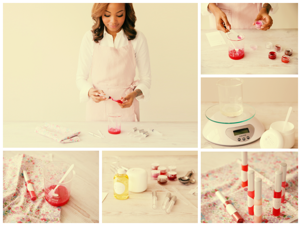
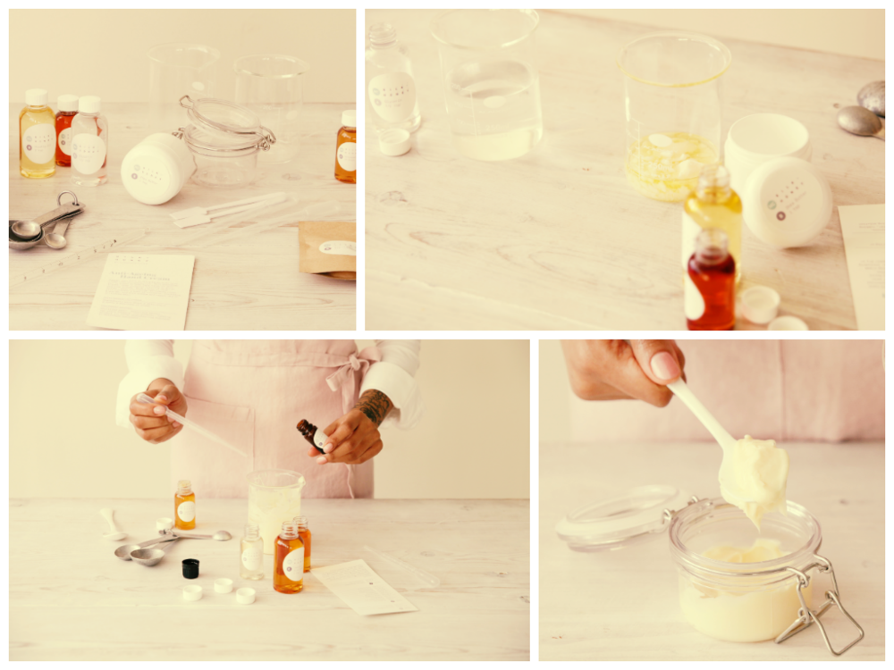
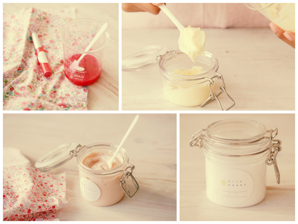


“We applied this thinking across the packaging and brand photography, stripping out any unnecessary information to make everything as pure as the products themselves. We introduced a colored coding system to make each kit as easy to follow as possible.”
Art Direction: Imagist


