Featured image for Love Popcorn

Love Popcorn

by Barbara Zandvliet on 10/08/2014 | 2 Minute Read

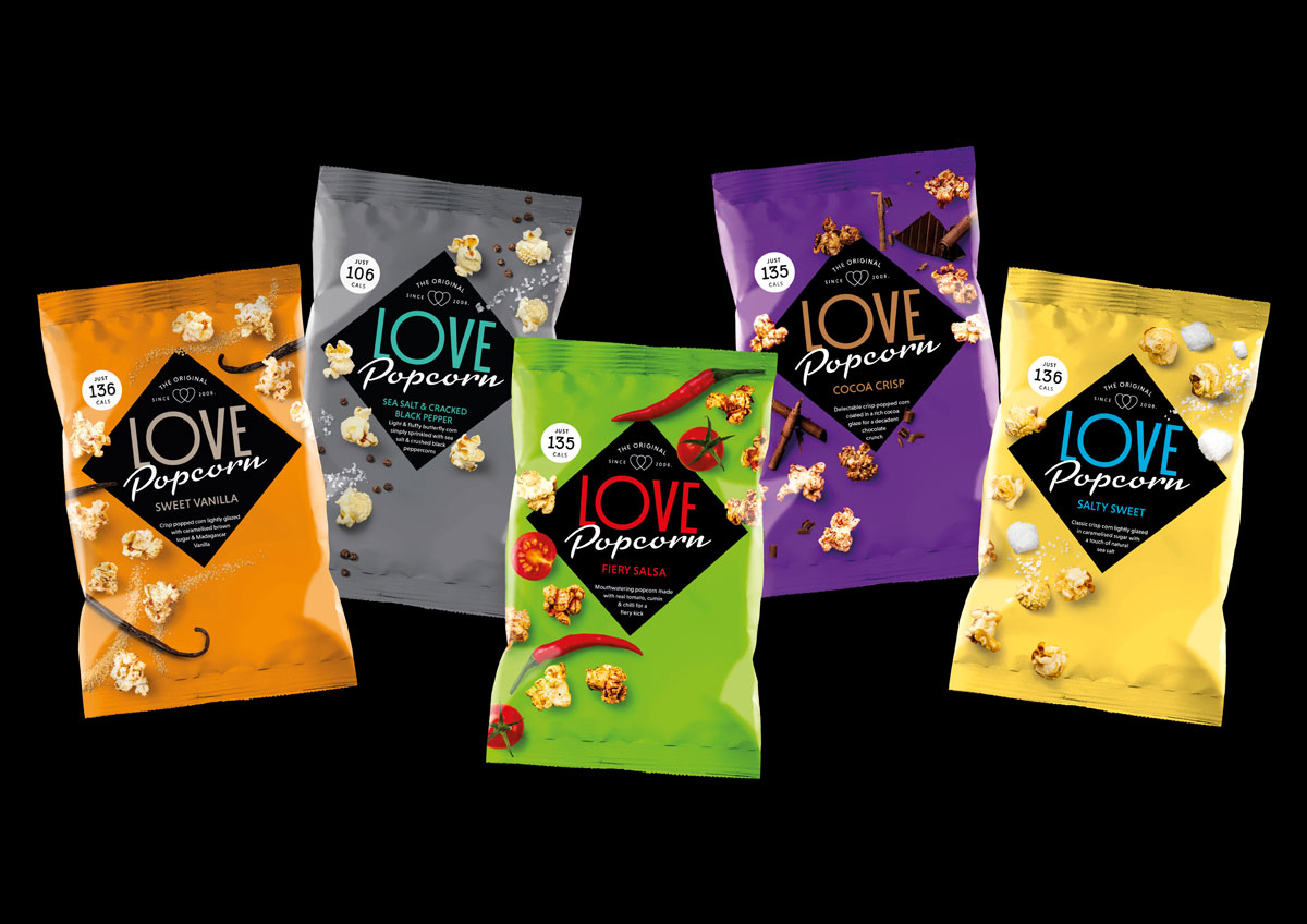
Brand and packaging design agency Robot Food created a new identity for foodie snack brand, Love Popcorn. The company began producing small batches of its all natural popcorn in 2008.

The company wanted to relaunch its product with a colorful new identity that gives popcorn lovers a taste of grown-up indulgence. 
Editorial photograph

"There’s no shortage of premium popcorn brands at the moment. But many are characterized by genteel visual identities and pale color palettes. No brand was particularly standing out. After tasting Love Popcorn, we were genuinely amazed. The quality is outstanding with unforgettably tantalizing flavors. It was clear that we needed to create an identity with impact and edge.”

- Simon Forster, creative director, Robot Food

Editorial photograph

The name is a celebratory call-to-action, and just like the name and the flavors, the design packs a punch. The color palette shouts loud and proud and the black diamond lock-up device acts as a bold stamp of quality. Real food photography emphasizes the real ingredients, which are scattered across the pack to form a signature stripe. 


Designed by Robot Food 

Country: United Kingdom