
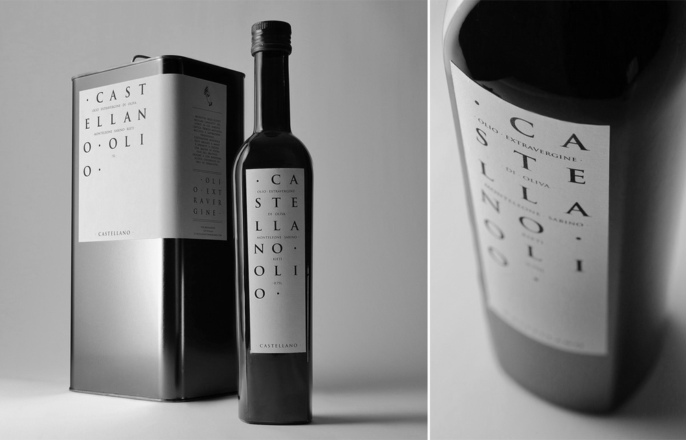
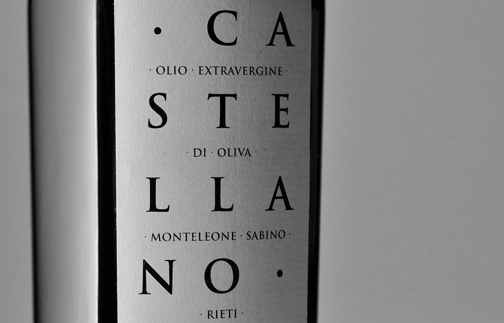
Typographic minimalism is what is achieved with olio castellano’s packaging by BCV associati. The name, printed on a slender strip of paper, is aerated, giving ample space for each letter to breathe. The overall design creates an interesting balance between the formality of the gridded layout in junction with its light spirit character that can be seen through its uncanny resemblance to cross-word puzzles.
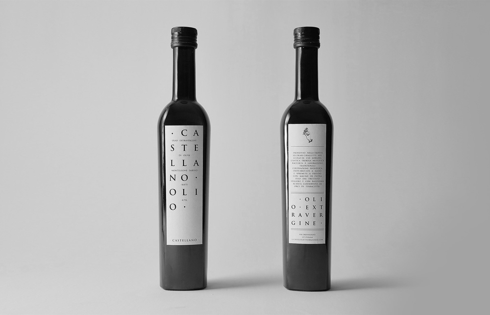
“The expressive synthesis comes from Trajan, a font as old as this place, and Trajan’s Column from which artist Carol Twombly drew inspiration for her design. Only one colour, black, and paper that is slightly rough to the touch, simulating the surface of stone. The text was composed in the Roman lapidary style (each word separated by a point).”
Designer: Alessio Galdi


