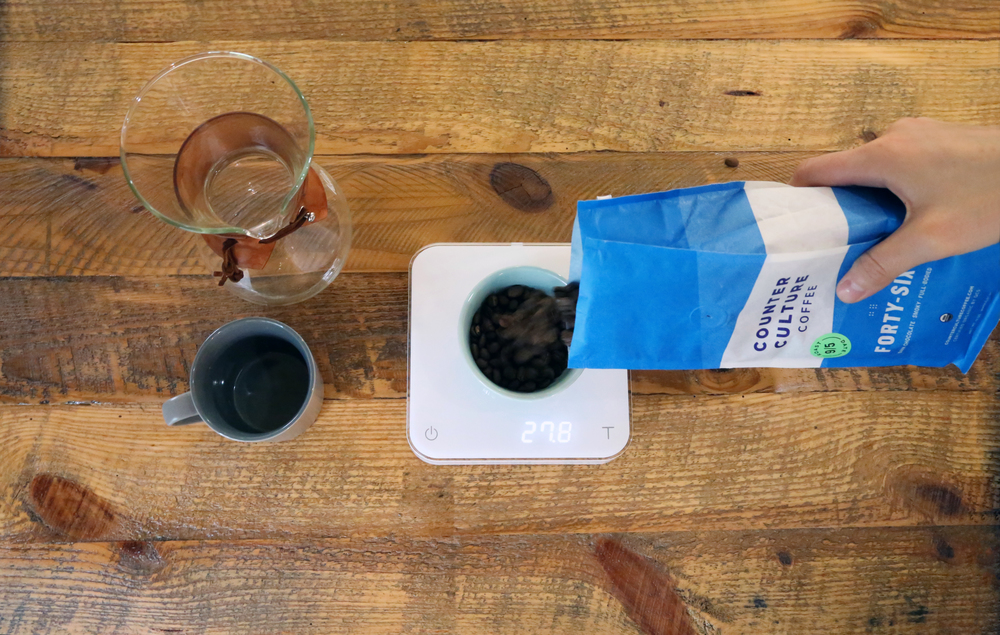
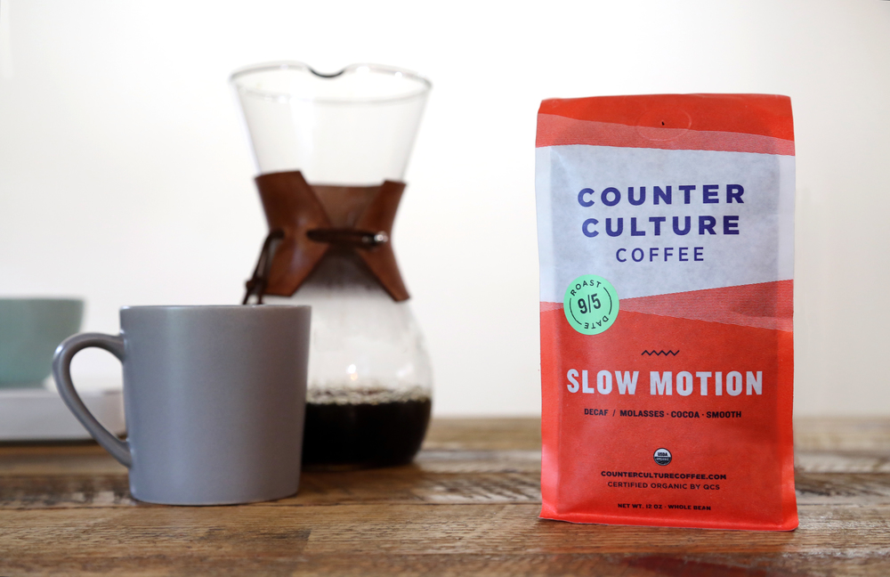
Open your eyes to the colorful world that is Counter Culture, where a rainbow bursts through the black and white sky. These coffees use rich saturated colors to advertise how they are different from the rest. The concept is to stand out on the shelves and be just as invigorating in digital format, while still maintaining a minimalist aesthetic of using biodegradable material .
“Our goal was to better communicate the core values that have guided Counter Culture for almost 20 years, while presenting a more contemporary and cohesive look”
–Counter Culture President Brett Smith.


“Each vibrant, eye-catching color used is representative of a year-round product or single origin coffee, allowing buyers to easily distinguish the varieties, and each product has a unique texture and icon that is representative of that coffee. Additionally, the roast date appears in a more prominent location on all bags, further underlining Counter Culture’s commitment to quality and transparency.”


“Counter Culture is committed to being carbon neutral—having begun purchasing off-sets and working toward reducing consumption since 2011—which requires annual measurements of carbon activities from roasting coffee to facility energy consumption and beyond. Counter Culture’s strong relationships with the farmers and communities who create their coffees are yet another facet of their business that epitomizes their commitment to environmental, social, and fiscal sustainability.”
Designed by Counter Culture
Country: United States


