
2013 is officially over and 2014 is in full swing! Earlier this month, we compiled our annual year end recap: The Dieline’s Top 100 of 2013. These 100 posts, including The Dieline Awards 2013 winners, were the most read posts of 2013. (If you have not read it yet, start there!)
After compiling the list, we began to notice several patterns and similarities between some of the top packaging projects of the year. Certain attributes such as color, type, shape, substrate, or style, started to appear over and over again across projects from around the world. After further analysis, we were able to distill these attributes into 7 distinct design trends that I believe will continue to take hold in 2014.
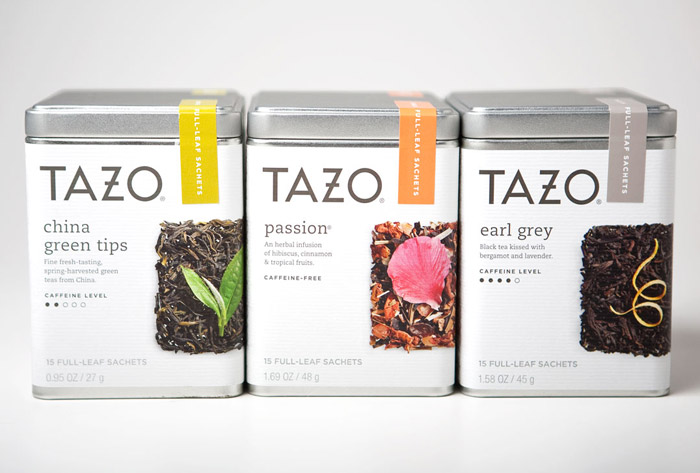
One major thing we noticed in 2013, was one “traditional” design element that was omitted among nearly all top projects & The Dieline Award winners: Product photography. Only 5 in the top 100 contain any sort of product photography, most opting for flat graphic illustrations, showing the product itself, or nothing at all.
See the 7 Emerging Package Design Trends of 2014 below!
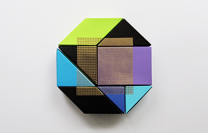
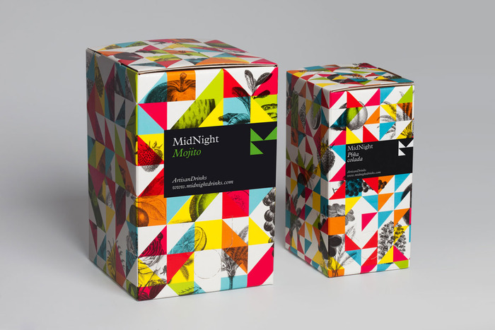
BOLD GEOMETRY

BOLD GEOMETRY is all about being fearless and brave with the use of geometric inspired patterns with a vivid array of colors.


CLEARLY WHITE

CLEARLY WHITE is the ultimate expression of simplicity and clarity. Opaque white typography printed on transparent substrates, showing the product inside and little else.


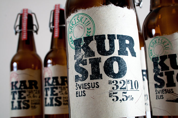
KRAFT IS KING

KRAFT IS KING: 2013 has shown that Kraft paper as a primary substrate is here to stay. Not only is kraft a sustainable selection, designers have been exploring innovative new uses of the material, and elevating it beyond looking “crafty”.


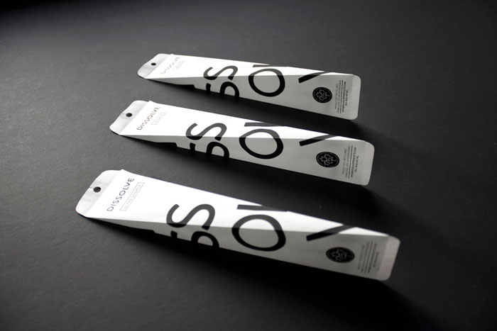
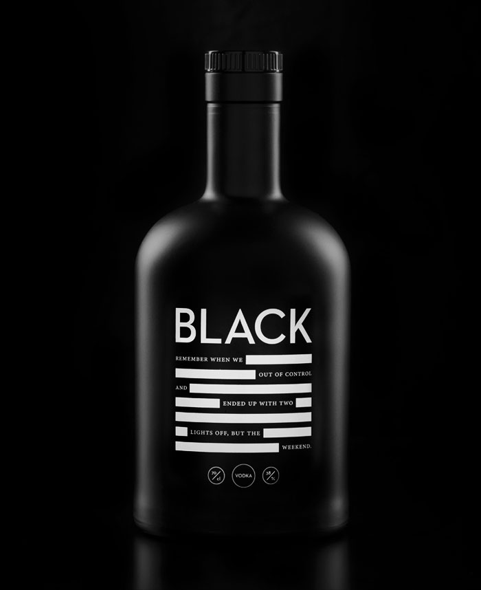
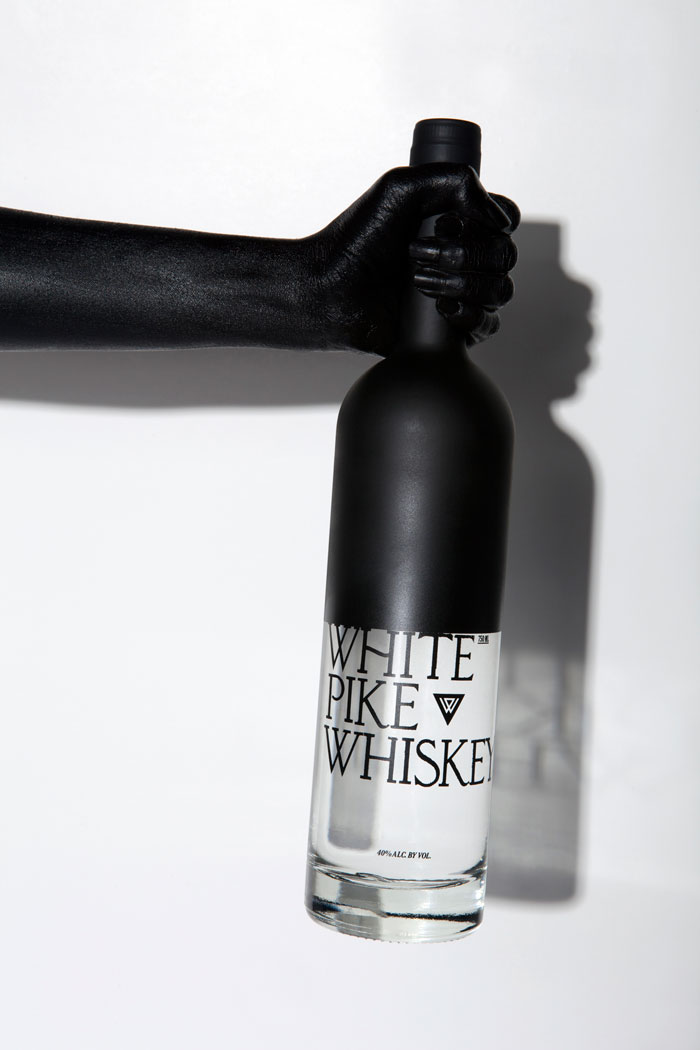
HI CONTRAST

HIGH CONTRAST: Black, white, and pure contrast. The ultimate attention grabber, high contrast black & white packaging is a tried-and-true solution that evokes on-shelf attention.


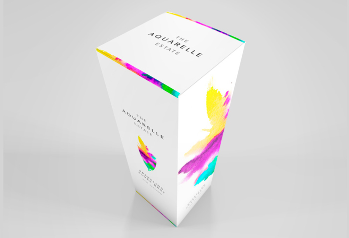
A WASH OF WATERCOLOR

A WASH OF WATERCOLOR: Calm, relaxed, and happy, splashes of watercolor and stunning watercolor based illustrations make this trend both visually striking, and warm and personable.


WHITE AS THE CANVAS

WHITE AS THE CANVAS: The cleanest base, a canvas of pure white layered with a limited palette of colors to make them pop. 2013 was the year that packaging went white, clean, minimal, yet still bold and colorful.


CURIOSITY

CURIOSITY is all about finding the fun in the everyday. Whimsy illustrations, bright pastels, and pops of personality turn every day consumables into an everyday smile.


Trend packaging renders designed by The Dieline and rendered via LiveSurface Context


