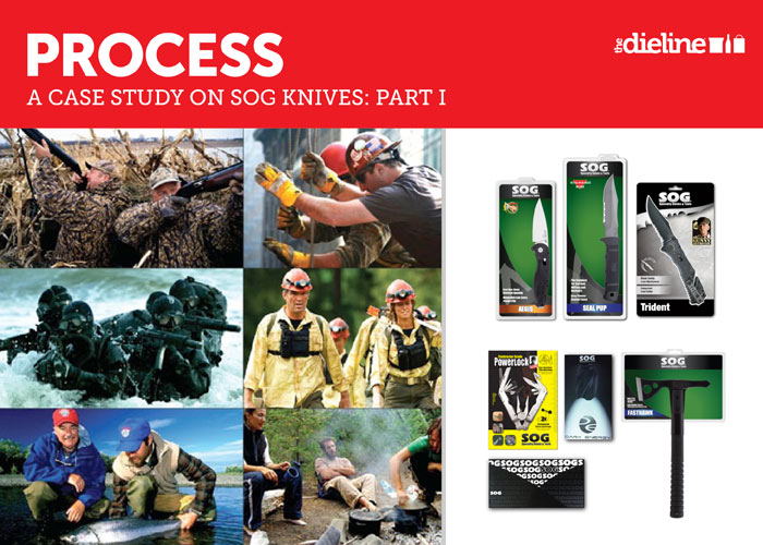
“We learned very quickly that SOG is more Bourne Ultimatum than boring old 007. This is a brand that works directly with Navy Seals to develop combat specific products; a brand that has been proven time and time again in the most extreme and harshest environments. We knew that they needed to own this ‘bad-ass’ portion of the market properly.”