06 09 2013 INTERAPOTHEK 1

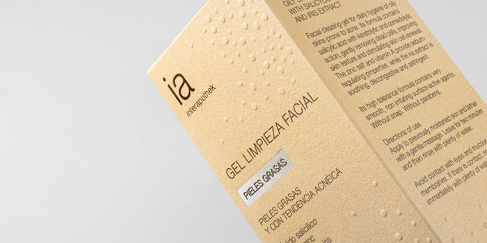
“The graphic solution for Interapothek is inspired on the expression “to get to the point” (or “to the spot”, as we say in Spanish): the package shows a vivid representation of the problem and of its remedy. Embossed spots cover the package, except where the name of the product has whipped them off. The cardboard chosen has a touch and a colour very similar to human skin. On the tube, instead, the spots have a shiny finishing as a sign of an oily skin. These simple effects elicit an instant reaction on behalf of the user, who recognizes and understands the message.”


As Eduardo explains: ‘Acne is a very frustrating problem for adolescents as well as for grown up people. This brand offers a complete solution for the prevention and care of acne, thanks to a high-end pharmaceutical formula.”

Designed by Eduardo Del Fraile, Spain

06 09 2013 INTERAPOTHEK 206 09 2013 INTERAPOTHEK 306 09 2013 INTERAPOTHEK 406 09 2013 INTERAPOTHEK 506 09 2013 INTERAPOTHEK 6

This placeholder is removed when the ad slot is configured.

This placeholder is removed when the ad slot is configured.

This placeholder is removed when the ad slot is configured.

This placeholder is removed when the ad slot is configured.

This placeholder is removed when the ad slot is configured.

This placeholder is removed when the ad slot is configured.