
An exclusive first look & interview about the rebranding, repositioning, and relaunch of Tazo.
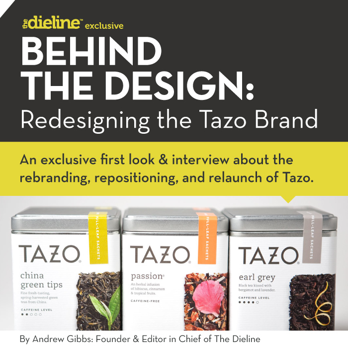
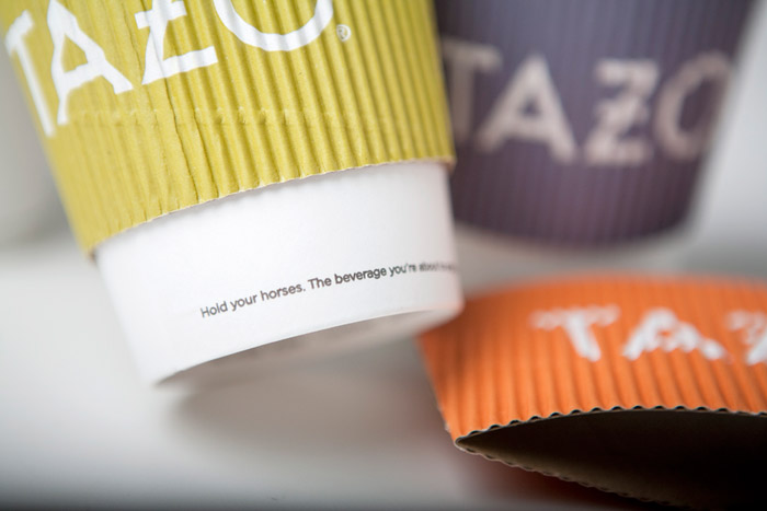
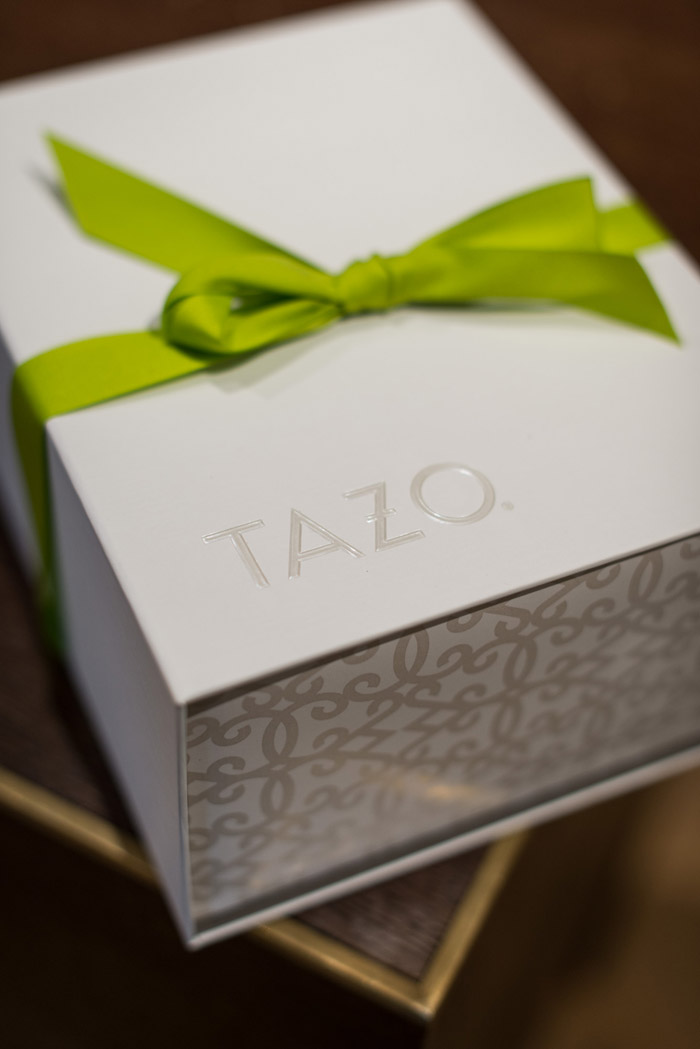
It all started when I first spotted the stark, stunning new Tazo packaging sitting on the shelf next to the suddenly old design. My first reaction was a bit of shock, in a delightful, surprising, and exciting way. It was not only a drastic change, but also a true leap forward into a new generation.
I have very fond memories of Tazo growing up; it was a breakthrough product of my generation. It is one of the brands that I credit for really getting me interested in package design as a possible career. Tazo first launched in the mid 90s with its mythical, Zen, new age, almost ethereal look, with Shamans and all. The brand really represented the times; it invoked a sense of humor and wit into the then boring tea category. It was a pure packaging story, and consumers fell in love with the brand. Tazo joined the Starbucks empire in 1999 as its leading tea brand.
Fast forward to 2012, the Tazo branding had been largely untouched since it first launched. After Starbucks finalized the redesign of the Starbucks brand itself, it was ready to take on Tazo. The challenge was to bring the brand into the 21st century, without losing its soul.
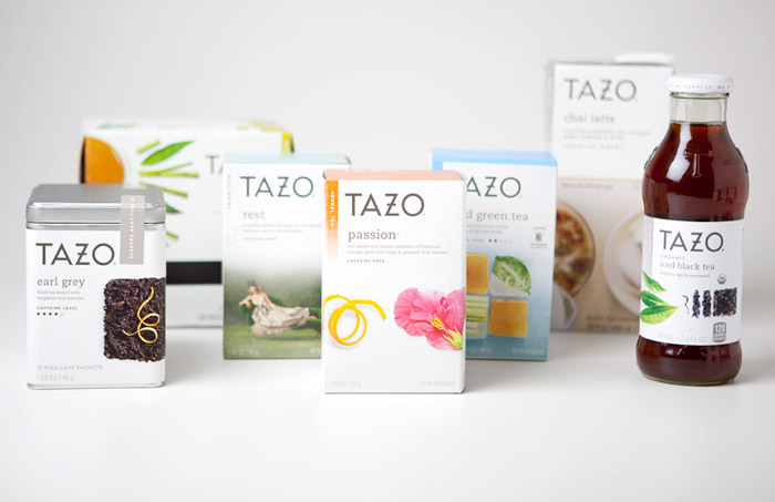
The task to update Tazo was given to an incredibly talented team of designers from Starbucks Global Creative, arguably one of Seattle’s best design firms. They are the in-house creative team behind Starbucks, Seattle’s Best Coffee, Evolution Fresh, Hear Music, La Boulange Bakery, Tazo, and now Teavana. They graciously invited me up to Seattle for a behind the scenes look at the new brand, the packaging, positioning, and the new Tazo retail concept.
GS_googleAddAdSenseService(“ca-pub-3860711577872988”);
GS_googleEnableAllServices();
GA_googleAddSlot(“ca-pub-3860711577872988”, “incontent1”);
GA_googleAddSlot(“ca-pub-3860711577872988”, “incontent2”);
GA_googleFetchAds();
GA_googleFillSlot(“incontent1”);
GA_googleFillSlot(“incontent2”);
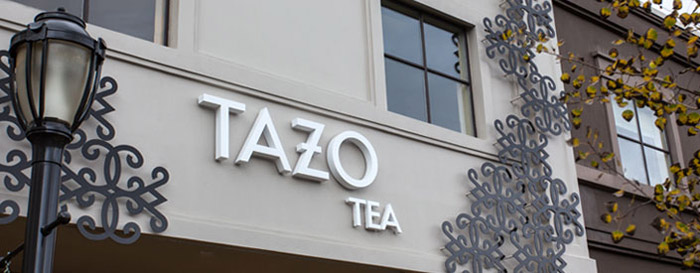
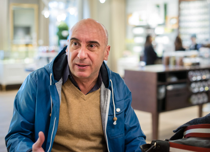
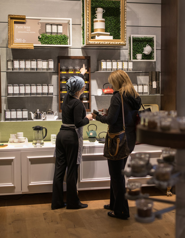
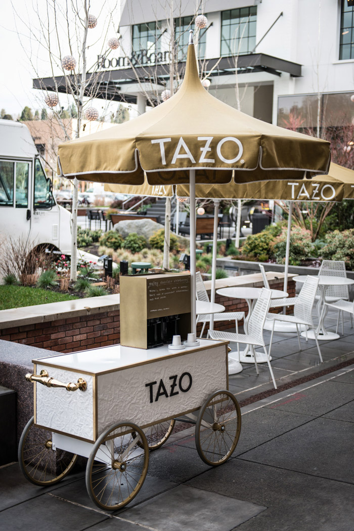
As I walked up to the first ever Tazo retail store in Seattle’s University Village, I knew I was in for something truly special. If the storefront was indicative of what was inside, then this was start of something extraordinary. I toured the store and sat down for an interview with the man who led the redesign for the past year: Daniele Monti, Creative Director at Starbucks Global Creative.
Andrew: This is a beautiful store, it’s really incredible! Would you like to give me a run down of the store, and a walk through of the new Tazo?
Daniele: Yeah, absolutely. So let me start at the very beginning because that is probably the best way to ground you in why some of the design decisions that you see manifested in here. When we settled on the project of the Tazo rebranding, one of the things we want to make sure is that, in rebranding it, we would bring the brand into 21st century, but so it doesn’t lose its soul. Tazo was very innovative when it launched and also when Starbucks bought it. Not only from a brand expression standpoint but also in a way that how the ingredients are mixed together. If you remember back in the days there was a lot of artificial mysticism built around the brand, with the Shaman and all the rituals.
It was all made up, honestly, but it worked really well at the time. Most brands, most of the competitors caught up with that, it was no longer standing for anything important anymore. So with this idea of revamping it we settled at the very core what Tazo was known for which was artful blending of the ingredients, and we wanted to take that idea, that concept of artful blending and expand it beyond the ingredients. So, we looked at ways to not only combine ingredients, but to do the same exact thing with styles and eras, places around the world.
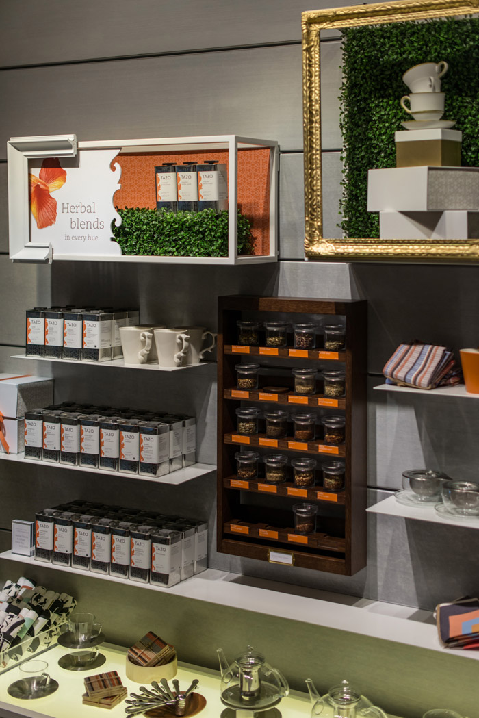
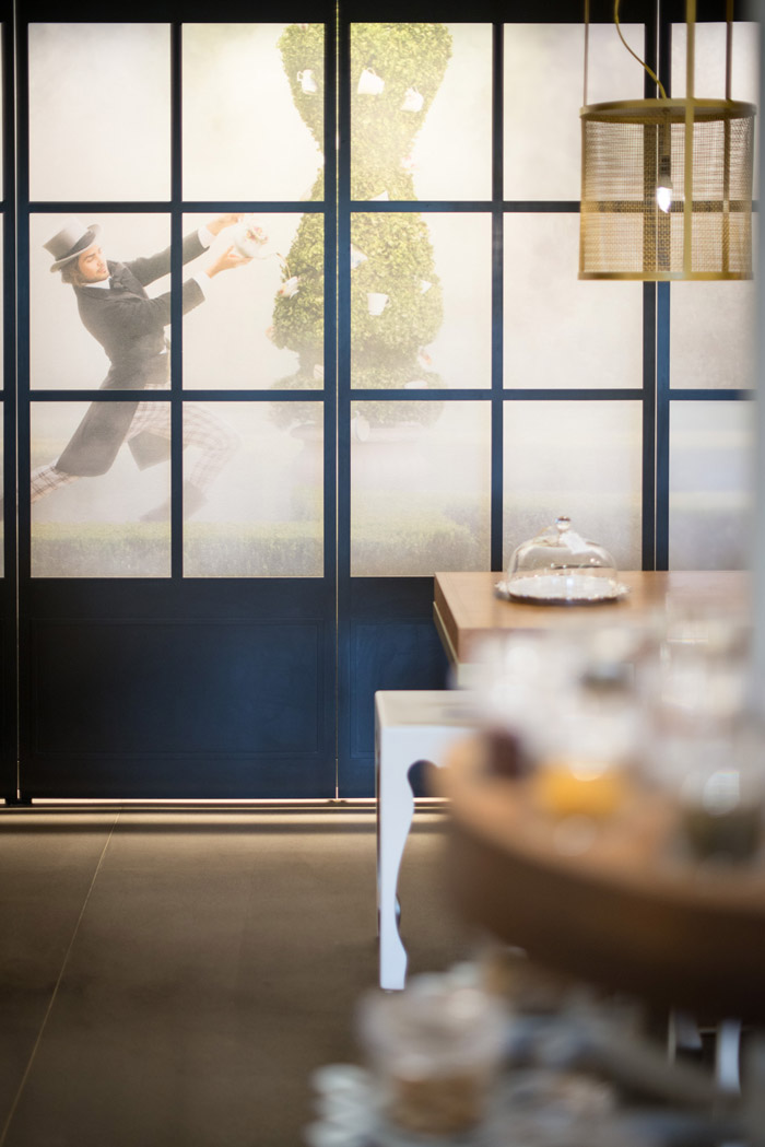
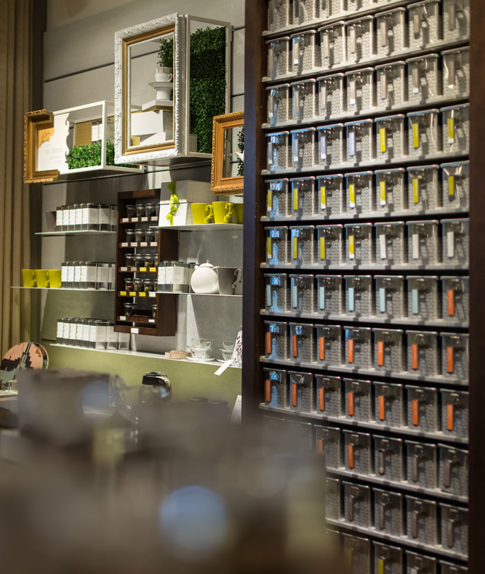
So, everything you see here [the Tazo store] wants to be that representation of all that, really a juxtaposition of style. It is hard to look at this place and say that it is modern, yeah but it’s also traditional, yeah but there’s also an edge of you know some steam punk. There’s a combination of things that are old colliding together, hopefully in a nice way and I believe that the response that we have had so far has been absolutely positive. So you’ll see this manifested not only in the design of the fixtures and some of the containers that we have and in the merchandise, hopefully and some of the things you see here that are proprietary designed.
“The idea was to make sure that the brand was modernized and brought back as a leading brand as it had been before without loosing all the good things it stands for.”
Andrew: Tell me about the new identity, the packaging, and the redesign concept as a whole.
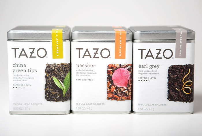
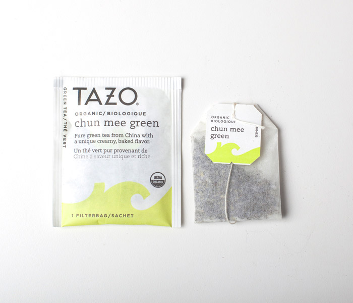
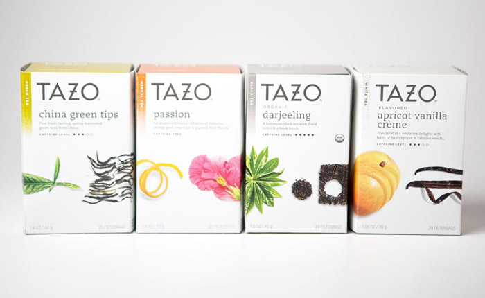
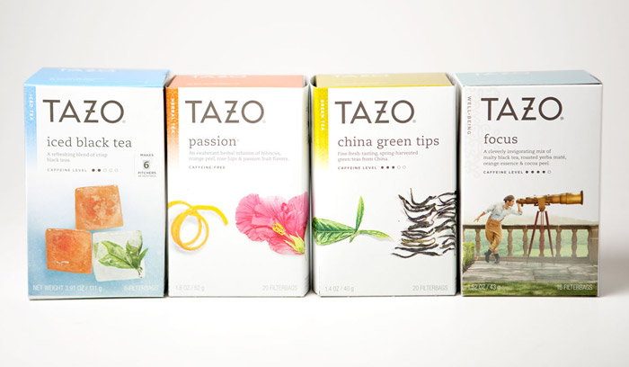
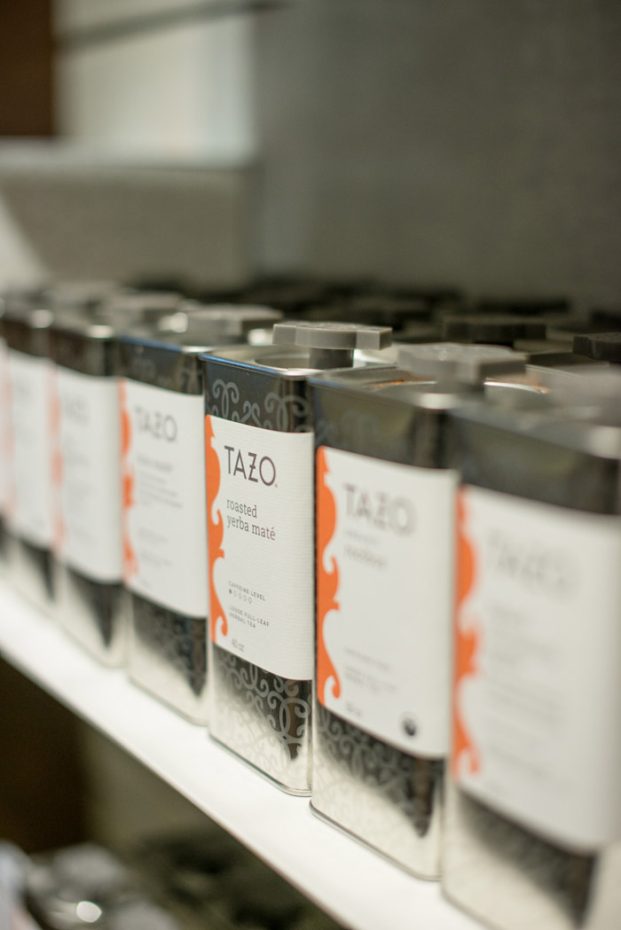
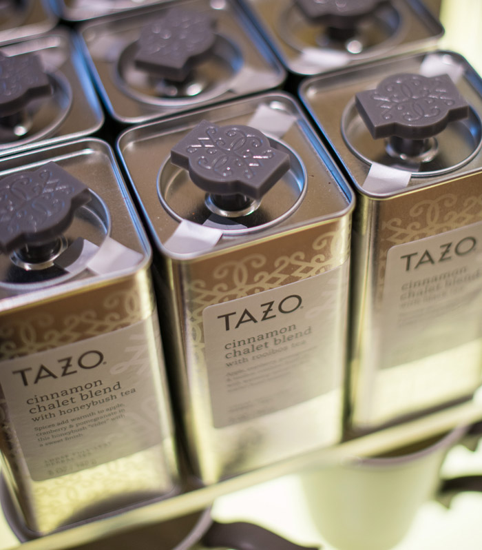
Daniele: The idea was to make sure that the brand was modernized and brought back as a leading brand as it had been before without loosing all the good things it stands for: the idea of mixing ingredients. You’ve seen some of the packaging have really, really detailed images of ingredients. We have worked so hard in making sure that each and every one of the ingredients is highlighted and shows the natural architecture, the natural design features and also the way they are displayed on the packaging.
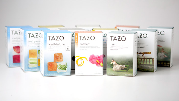
The idea for the CPG packaging; when it hits the shelf, the ‘brand blocking’ as we like to call it is not necessarily provided by the logo, but also the chain of ingredients. When you see it all together…when you see the shelf, it’s really powerful.
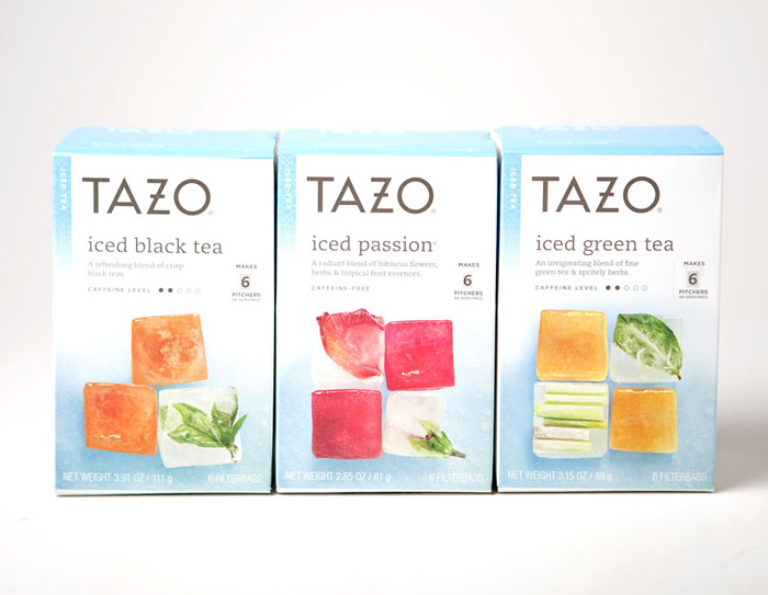
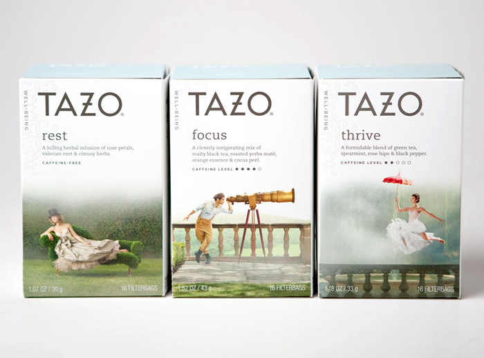
And we establish basically, if you can see the filtered bags; probably the most important piece of packaging that we have created, even in terms of volume. That was used to establish the main architecture of the design, and then from there each and every one of the derivatives, in terms of packaging; are following the same structure. Sometimes they show the ingredients, sometime they don’t. From the ready to drink products it’s necessary but the “well being” line we switch to life style photography. The structure stays exactly the same. They can see the shelf and it’s absolutely consistent and very powerful in terms of being a burning beacon.
Andrew: Tazo’s packaging was created nearly twenty years ago by Sandstrom Partners, and it’s been relatively unchanged since then. Why the big change now?
Daniele: Well, every piece of research that we have done showed that Tazo was doing well but not excelling in anything. We were floating in the middle. In terms of customer loyalty to the brand, even the quality of the product. Every one believed that the product was good, but not excellent. Not, because there was anything wrong with it but simply there were just not a whole lot of innovation happening in the industry in general and every single brand that came up after Tazo was, essentially copying us. You name it. They were basically inspired by what Tazo did 15-20 years ago.
So, the change was necessary to revamp the brand and to reclaim, stories and territory that was ours to begin with, the idea of the artful blending, the idea of this combination of ingredients. Tazo is not really known for pure teas. We have pure teas in here, but not known for pure teas in the CPG isle. There’s always a combination of ingredients in there. The idea of highlighting that, through ingredients, rather than just showing a cup of tea, which is what we had before, felt like the right thing to do in order to make the story even more relevant.
Andrew: Tell me about the revolution of the new design. How did it evolve from the concept to what it is now?
Daniele: I have to say that from the original concept…the biggest challenge was the form factor. Given the timeline that we had ahead of us, and the budget we had to work with. We immediately had to establish whether or not we were able to step out side the carton that we currently have and I’m just talking about the CPG, this [the store] is a different story. We also had to consider keeping it in the same price point and all the other considerations.
But once it was clear, mainly, because of timing we had to stick with the form factor that we had initially. Then the evolution was, well, frankly the exploration was a lot tighter and revolving around an existing form and what we are allowed to do technically.
At one point we had a really interesting solution that included a slit, literally a cut inside the box that was showing all the filtered bags inside, and unfortunately we couldn’t go for that because there was no way keep them in a beautiful organized fashion. So, when they shake it gets all messed up. You don’t really want to reveal that. The design exploration was actually quite a beautiful experience. We went all the way down to producing it, did a shipping test, and once it came back, we decided it was too risky. We decided not to do that.
“Sting has an album that used that font for the entire album. I can’t even remember. It wasn’t even proprietary.”
Daniele: The other part that required a lot of thinking was the logo.
So, the logo, as usual when they do a restyling, or a redesigning of a logo, you want to make sure that you establish up front if you’re exploration is going to be done within the area where the current identity is right now or how much you want to push out. As usual when we do these kinds of explorations at Starbucks, we don’t want to limit that range, but we know where most of our time’s going be spent. We wanted to look at something that’s a little more revolutionary and probably doesn’t even resemble the old identity but we know that that’s going to be 10-15% of our time. Most of the time has been spent, in the vicinity of the old identity and there were couple of things we needed to solve from a technical standpoint. Getting rid of the black brick.
That was causing a lot of, well not a lot, but definitely some restrictions, in the flexibility of how it could be used. And the other problem that we had, that old logo, the typography wasn’t even proprietary. It was a font that was used in the mid 90s. You’re probably too young for this.
Andrew: (laughs)
Daniele: Sting has an album that used that font for the entire album. I can’t even remember. It wasn’t even proprietary.
Andrew: It was a very 90s font. It screamed the 90s.
Daniele: It was so defining an era. It was too confined. We cannot be so recognizable. But there were some things that was actually working for us that we wanted to maintain; the cross bar on the Z, that element is still there. The perfect circle in the O. That’s still there. It’s basically a stylized, a modernized exploration of the letterform that we have.
Andrew: Did you guys explore the cross arrow in the O?
Daniele: We did. There was a long debate about, keeping it or getting rid of it. One of the things that, you probably don’t know is that the original Tazo logo, when it was first founded, so, prior to the acquisition. The “T” was also a cross.
When we wanted to sell it out side of the US, especially the Middle East, it started to cause some problems, in some religious cementations. So, we changed to a more regular T. The one inside the O remained. But when we did the new design, it was a good opportunity to start fresh and simplify even more. With the ambition of Tazo truly becoming a global brand, we wanted something that was working at a global level, so that was an easy decision in the end.
Andrew: With the launch of the Tazo brand as it’s own stand-alone store, Tazo is no longer just a product that is sold in other stores. How did that that factor into designing for both the retail store and the CPG brand?
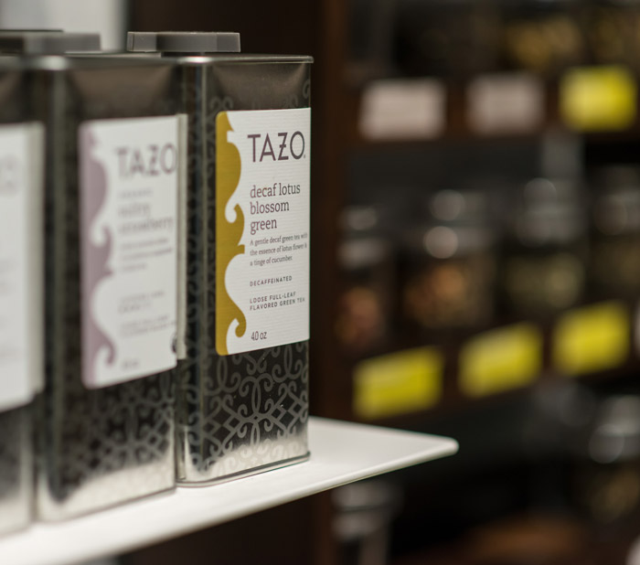
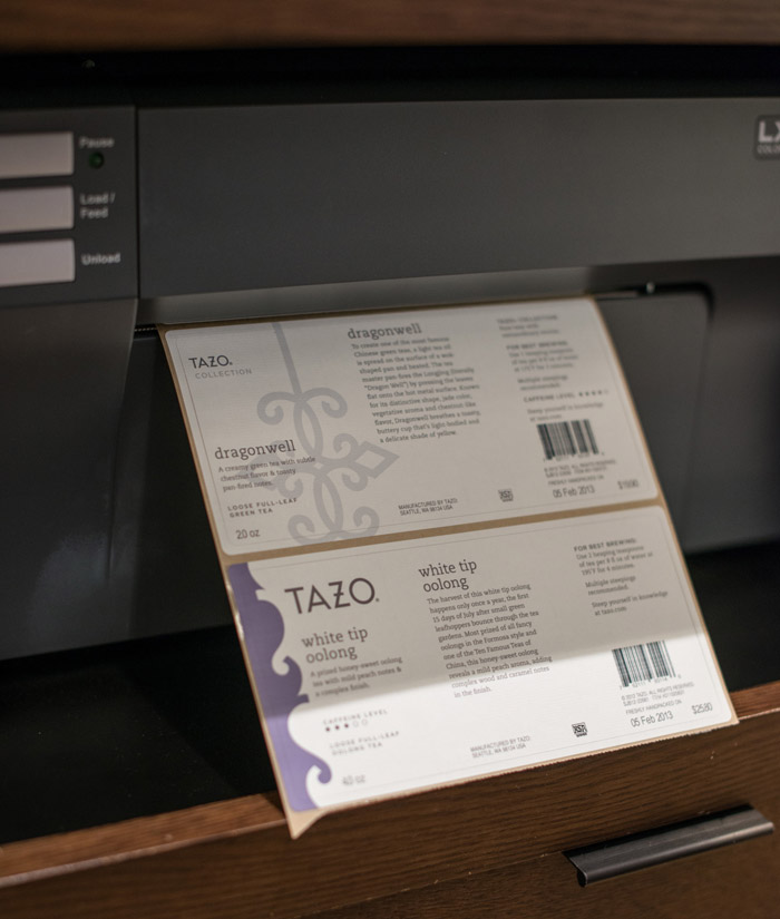
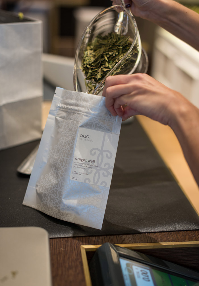
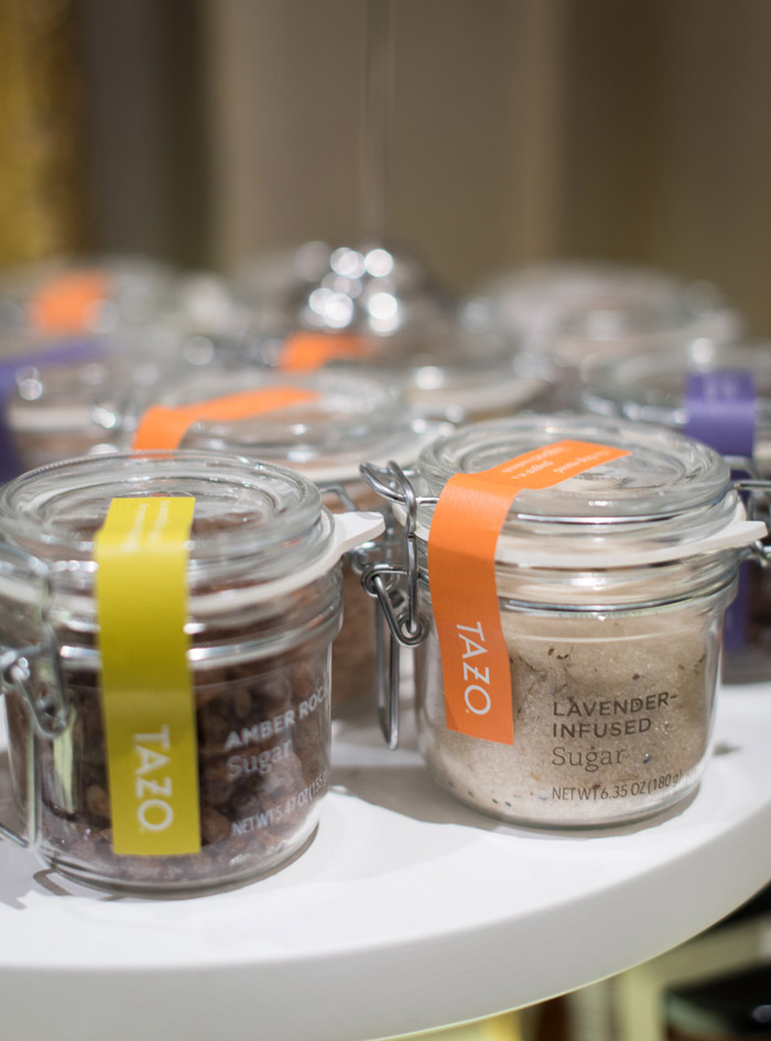
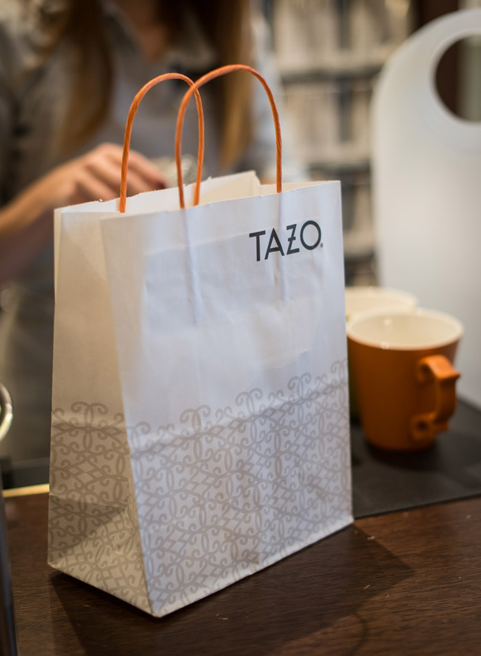
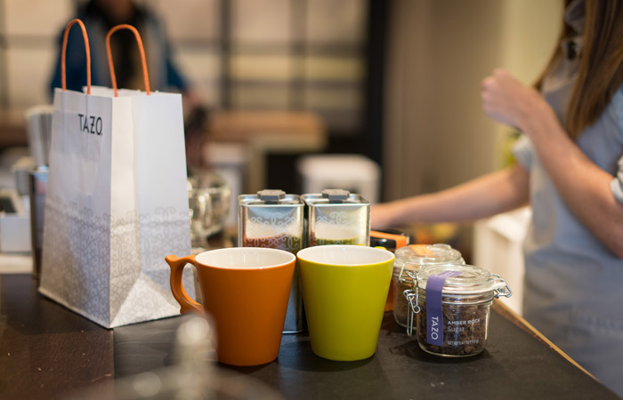
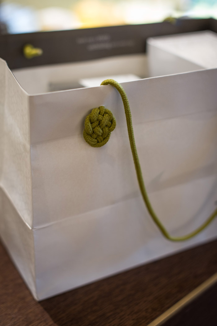
Daniele: So currently, there are no CPG products in here (the Tazo store). It’s still up in the air whether or not those are ever going to land in the store. But I don’t think that the idea of the packaging itself was influencing the store too much. In fact, as you look around, none of the CPG packaging is even represented or has inspired the packaging that is inside the store. We absolutely wanted to make sure the store has an artisanal feel. The labels are printed on site. There are two printers here that spit out the label and it gets applied to the tin or the pouch, depending on what you are buying.
But, everything else, every other element of the brand, every other piece of vocabulary that we have built around Tazo is represented in here. With the additional bonus from my point of view that, when you moving that into a three dimensional space, you have far more opportunities to bring that to life than you would with paper or pixel. So, I guess the idea was for this to become a concentrate, pinnacle of every single design elements that we had created for packaging and beyond and amplify that to the antiquity.
Andrew: Gone is the old kind of tribal, earthy, ethereal design look. How would you describe the new look?
Daniele: Well we have brand differentiators that if we’ve done a good job, everything you see here should lather up to that. So, the idea is for this brand to be curious, well traveled, there’s a bit of whimsy. There’s definitely a magical spirit around it, but not mystical. It’s not that artificial mysticism that was so much part of the old Tazo. Those are probably the things that come to mind as the strongest work, or aspiring to be appealing to a very specific audience; people that are between 18 to 32 years of age, probably around 50/50 or 40/60 male/female. People that not necessary have a ton of money at their disposal but they know very well how to spend them. They are well traveled. They value digital and analog at the same time. They are absolutely wired and are probably bloggers themselves.
Andrew: (laughs) Sounds like me
Daniele: They have Moleskins. They take notes or a journal when they travel the world. So there are some decisions that have been made to appeal to that audience, obviously knowing that everyone else is going to come in. It’s almost like, when you look at Nike for an instant, they target professional athletes but doesn’t mean they are not selling to anyone else. There’s an aspiration audience that they bring along.
“We call it the agony of the leaf, when it’s in there steeping, and it’s just beautiful.”
“I strongly believe that design is a subtractive process. Just get rid of everything that is not necessary. That’s what we did. We started stripping out what is not needed and that was it. That was the packaging. Done.”
Andrew: Next question comes from Yael Miller, one of our editors at The Dieline. She coined the phrase “generic syndrome” and it’s something that she has seen in the past with other brands; when an establish power brand ditches their old packaging in favor of a modern, clean, white esthetic with beautiful photography. “Generic syndrome” happens when it gets mistaken for a house brand or a store brand. Why did you guys not fear “generic syndrome” when approaching the packaging redesign, and how were you comfortable of getting rid of so much of the brand equity as it appeared in the retail packaging?
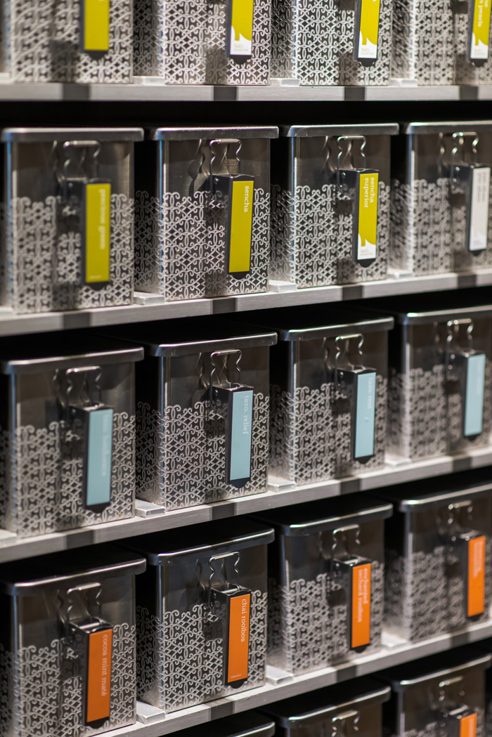
Daniele: That’s a really excellent question. So, when it comes to the simplicity, even more specifically the use of white. If you look at what a tea shelf looks like today, it’s crazy. It’s absolutely insane. It’s an explosion of colors and it’s every brand, with couple of exceptions, but almost every brand. It’s “the more colorful, the better”. In a way, makes total sense, color matches of the world of tea. There are beautiful colors there and it’s definitely something that stimulates the senses in the right way, but in terms of brand recognition itself, it’s nearly impossible to really stand out if you follow that same path.
So, we decided to go with something definitely simpler and something that was bringing up some information that frankly were relegated, even from some of our competitors, caffeine level being one of them. In research, we found out that caffeine level is a way that people deselect from their purchase intent. Unless their purchase intent was to get ultra caffeinated and then flavor is actually a selector. So, the combination of those two, it’s the x and the y are essentially how people are starting to identify what tea they prefer.
When you start looking at information on packaging that get so technical and inspiring, even in the writing. I don’t know if you get a chance to look at some of the descriptions. It is well written and it ladders up again to the idea of life re-blended. You don’t really need to say much more. So, the only other visual that we wanted to have on there were the ingredients. That’s the story that we can tell. I strongly believe that design is a subtractive process. Just get everything that is not necessary. That’s what we did. We started stripping out what is not needed and that was it. That was the packaging. Done.
“The only thing we wanted to get rid of, was in all honesty, anything that was not authentic, again, all the stories about the Shaman, all the things that were frankly made up, fun, a lot of fun, but not authentic.”
Andrew: What would you say to the people who feel that Tazo brand equity has been forgotten?
Daniele: We had a lot of internal, mostly internal, especially from designers a lot of harsh scrutiny, especially those who worked on the brand for many, many years and they say, “What? You’re getting rid of that? Really? Are you guys crazy?” I think that in the end, we did a good job, from my point of view in balancing out what we have kept.
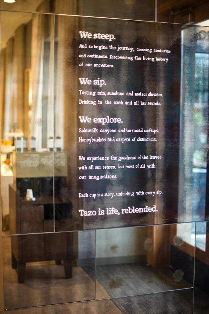
The only thing we wanted to get rid of, was in all honesty, anything that was not authentic, again, all the stories about the Shaman, all the things that were frankly made up, fun, a lot of fun, but not authentic. They felt completely redundant at some point and we wanted to replace that with beautiful writing that really exemplifies what the brand promise stands for, the Tazo manifesto which is at the entrance.
I would suggest you look at that as well. In the description of how the tea experience comes to life through the Tazo lens, there’s this idea of this magical, this idea of beauty, this idea of curiosity, this idea of traveling the world without moving one step, that really inspire, from that point of view, I don’t think we have neglected or left out anything that was true to the old brand.
Andrew: How is the process of redesigning the Tazo brand similar or different from redesigning the Starbucks brand itself?
Daniele: It was the same in terms of the steps of the process that we took. Even though it has evolved slightly from case to case. I think we have to down to frankly to a science at this point. I think it was something we follow the same milestone every time, as a structure, as a container. The content is obviously completely different. Because we’re talking about different product, different culture, different audience, different brand equity that Starbucks had vs. what Tazo had. Tackling the Starbucks brand was something we had to, put on these white gloves everyday and make sure that we don’t mess it up. This is worth money! That is always true. I believe that the brand is probably the strongest asset that the company has. But there was definitely a lot more freedom for Tazo than we had for Starbucks.
Andrew: Can you tell me about the textured labels? I’ve noticed that on the packaging here and even some of the CPG, the tins with the textured labels?
Daniele: We wanted to be sure that by making various choices like style, photography, the white background, the modernized logo, the choices from the typography standpoint. It’s staring to lean towards the clean space, more minimalist to your point. We wanted to compensate for that, making sure it wasn’t coming across too cold. Especially when it’s on a tin, the material itself how it feels when you touch it. We wanted to make sure there’s a little more of warmth. That’s why we ended up with the textured label.

Andrew: How does the new Tazo brand fit into Starbucks acquisition of Teavana?
Daniele: I think it’s just demonstrates that Starbucks is quite serious when it comes to tea. I do believe that both brands have a space in the portfolio. Probably some adjustments will have to be made one way or another to make sure they both have a role in the portfolio. But again, from my point of view is, it demonstrates and shows that Starbucks is serious about tea and being a relevant player in the category.
Andrew: Now, what do think is the differences between the Tazo brand and the Teavana brand and how are those are going to be signified going forward?
Daniele: There are some differences that are quite obvious, especially when you walk into this store and a Teavana store. Probably the one that stands out the most from my point of view is that, if you consider Tazo a way in which that tea is demystified and almost democratized. The way the blending stations are set up and you can play with the ingredients etc. is almost completely opposite of Teavana, where everything except the samples are behind the counters and you have to rely on the tea-ologist to get information about the tea etc. and for me this feels like a slightly more younger audience and Teavana is a more mature audience. Eventually I think we might see the difference more defined.
Andrew: Would you say Tazo is to Seattle’s Best as Starbucks is to Teavana?
Daniele: No, I would not push it that far. I think that the Tazo customer still is quite sophisticated. Seattle’s Best is about convenience and coffee, good coffee, everywhere. I think that this audience is still interested in learning about the culture of tea and not just attracted by something that tastes good I think it goes deeper than that.
Andrew: What is the future of Tazo brand and Tazo retail concept?
Daniele: The Tazo retail concept, I think that this right now is just a lab. It’s something that has just been open a few months. We’ll watch it and learn what we can get from it and make decision based on that. The Tazo brand, the future in general, is really bright, it’s a strong brand in our retail stores. It’s a strong brand in CPG. The restage is not even complete yet. So, soon we will look at the results of how things are going. My expectation is that things are going to be positive all the way.
Thank you to Daniele Monti and the team at Starbucks Global Creative.
By Andrew Gibbs
Founder & Editor in Chief of The Dieline
Design Team:
Amy Lam
Nicole Gutierrez
Anasazi Mendoza
Bryan Chackel
Kristy Cameron
Design & Copy Managers:
Fumi James
Mike Peck
Carole Hurst
Copywriters:
Carole Hurst
Francesca Merlini
Sarah Bergey
Creative Director:
Daniele Monti
Photography:
In-store shots by Curtis Edwards
Products shots by Starbucks Global Creative


