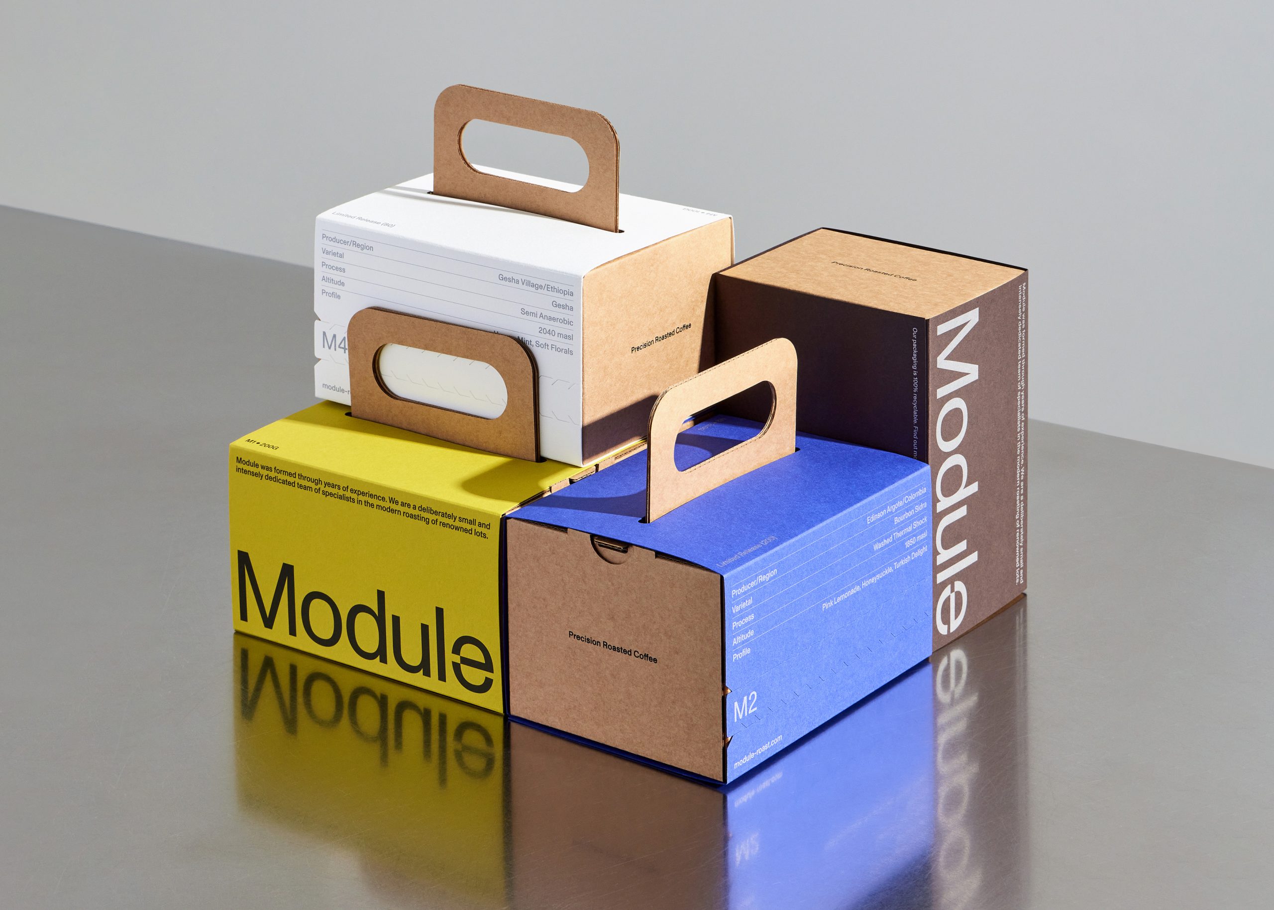
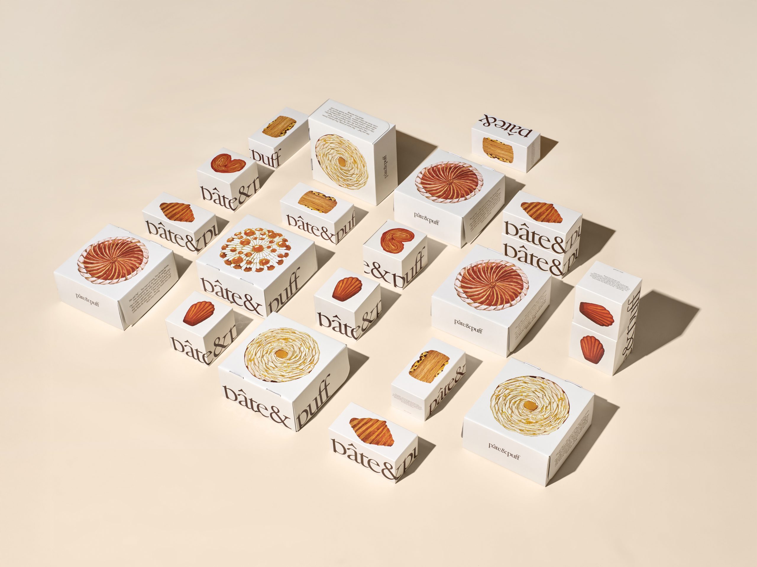
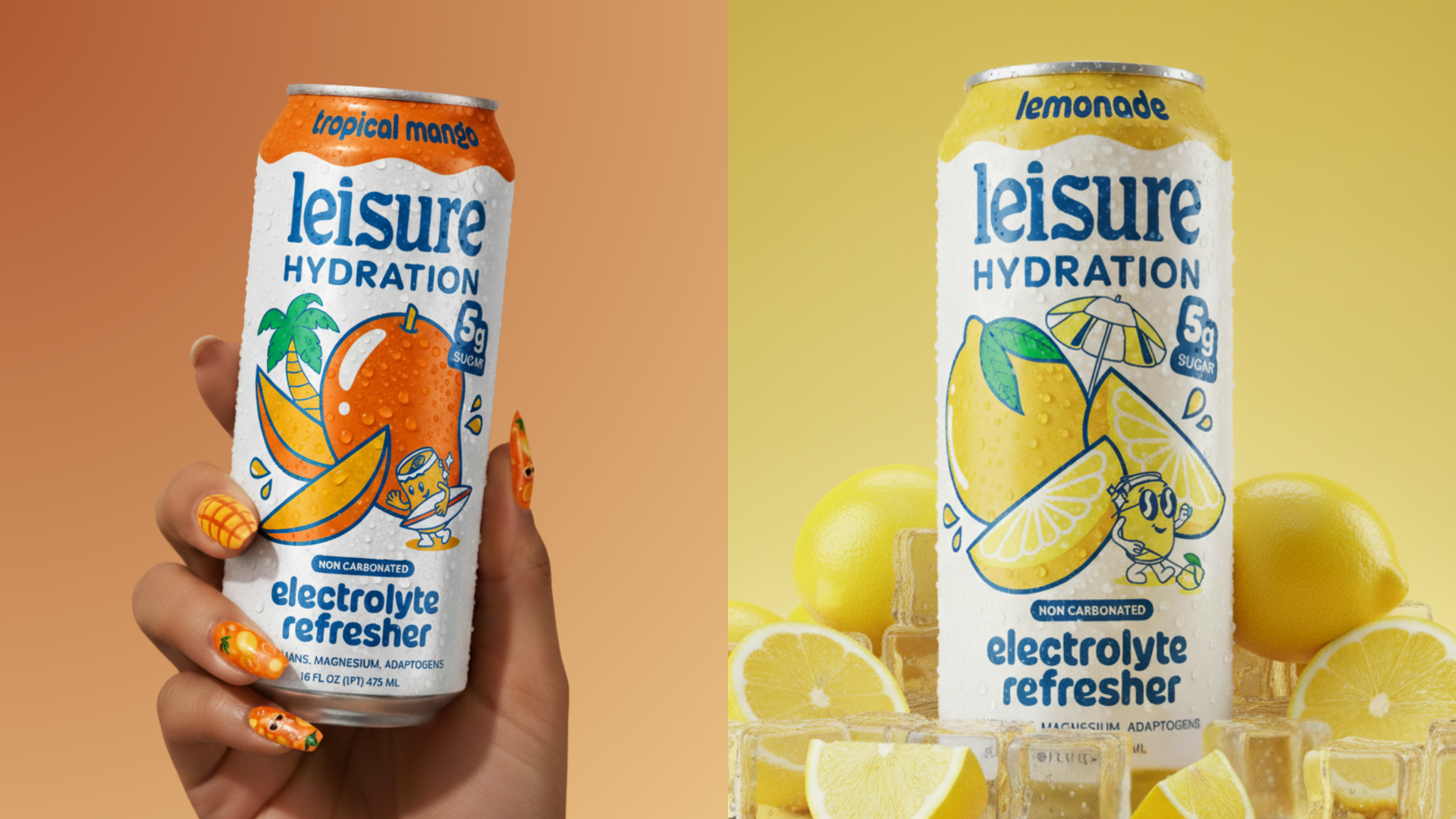
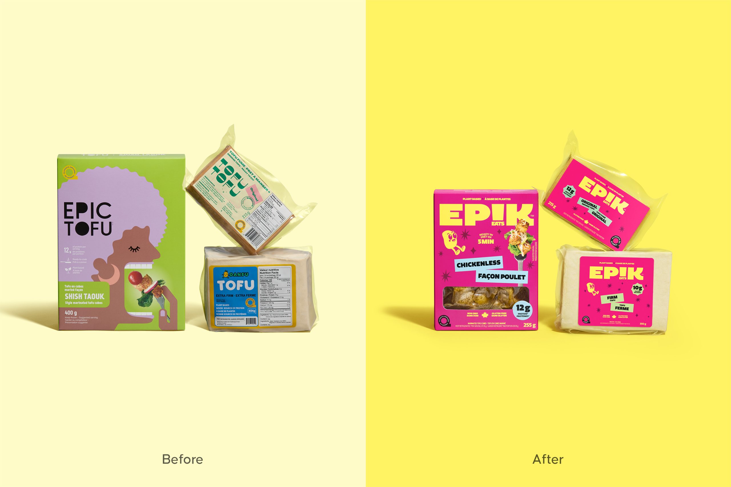
“Japan is known for its passion for innovation, precision and the mastery of fine techniques and complexity. So when Energi were engaged to develop the brand identity and packaging for a premium range of ciders from Kirin we set about our exploration of various disiplines before focusing our sights on traditional Japanese calligraphy and watercolour art styles, leveraging this in our designs.”
“In a collaboration with Melbourne based Japanese artist Junko Azukawa a series of beautifully crafted artworks were created for each of the ingredients, along with a sumi-e style apple tree branch and the ink calligraphy of the sub brand kanji characters. With care, these core brand elements were combined on the packaging with a brush stroke to hold the kanji characters, a hand painted circle to frame the ingredients, and a traditional red artwork signature stamp, all to capture the attention to detail of authentic Japanese craftsmanship.”


