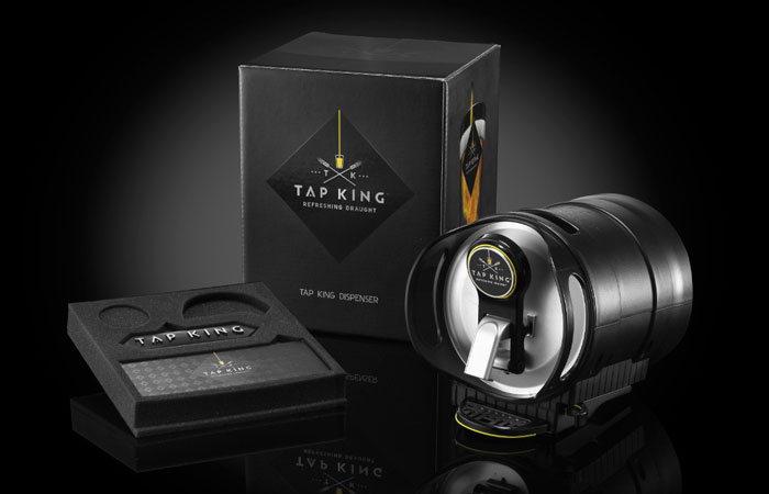
Featured image for Grassini Family Vinyards

Grassini Family Vinyards

by Tiffanie Pfrang on 10/24/2013 | 3 Minute Read

Editorial photograph

Duffy & Partners created package design for Grassini Family Vineyards as part of an extension of the vineyard’s first phase of brand revitalization released in 2011. "Duffy embraces the power of design, using brand language that serves as a flexible, expandable and connected device. Ideals of art and craft in design are used as a means to communicate the authenticity and value of the Grassini Family Vineyards brand."


"Duffy’s challenge was clear: to craft an expression of the family that embraced their ancestry, positioned the vineyard for growth, and differentiated it among a sea of competitors. Grassini saw an opportunity to expand their offerings by expanding their premium wine offering and introducing a series of everyday varietals. Grassini looked to Duffy to create a design that adequately reflects the nobility of their craft."

Designed by  Duffy & Partners, Minneapolis 


Editorial photograph

Reserve

Available in both red and white varietals, the reserve line takes cues from the original design released in 2010. Metallic silks-screened bottles have luxe appeal and feature a black letterpress label with metallic ink. The back label has been replaced with a silk-screened message emblazoned in gold. Individually signed and numbered, each bottle is hand-dipped in a gold wax seal.

Editorial photograph 

Everyday Varietals

Sauvignon Blanc and Bordeaux blend wines, Happy Canyon and Articondo, feature a simpler letterpress label with illustrative imagery from the history of the vineyard land and the family homestead. Siblings in design, the labels also feature familiar icons of a rich harvest: rooster, bull, and wheat shafts. The illustrations offer a nod to the Happy Canyon landscape and are a subtle nod to Grassini Family Vineyards’ commitment to sustainability.

Editorial photograph Editorial photograph

Editorial photograph 

Equipo

A wine made by the vineyard’s crew, Equipo, pays tribute to the values of steadfast hard work. This unique offering is the product of a special vineyard lot dedicated to the crew, to be farmed and harvested as they see best. Simple highlights of varietal and production basics, with the seal of a wheelbarrow and a tag-like label, are designed to project the touch of the hands behind the harvest. Letterpress accents like the perforations give the bottle label a tear-away working label look.

Editorial photograph


Editorial photograph