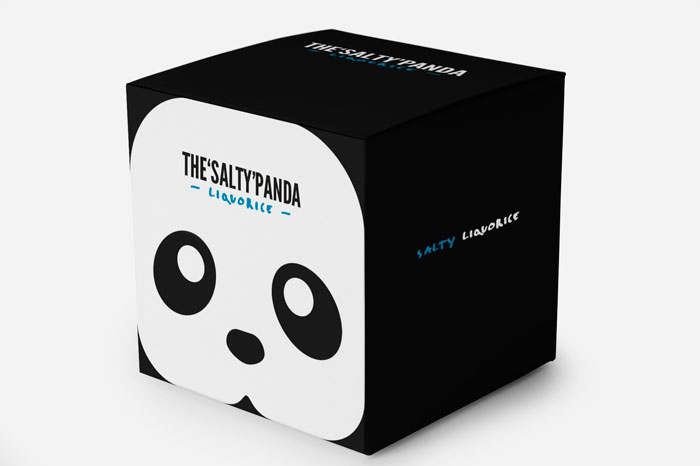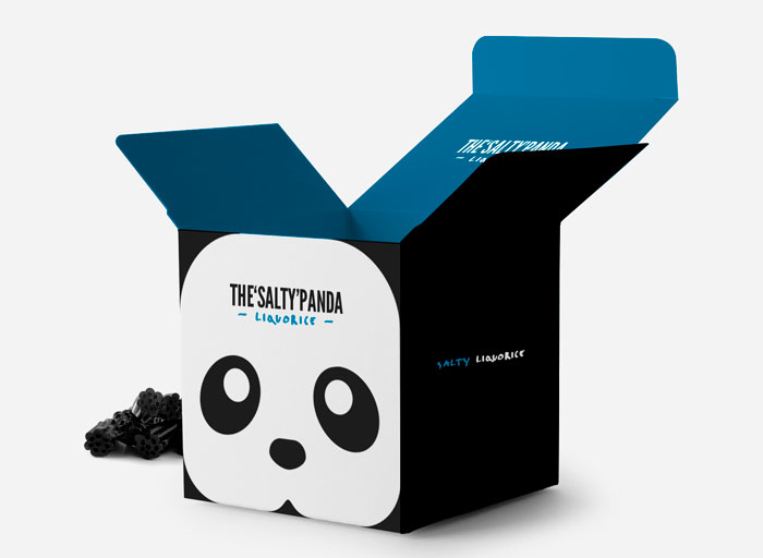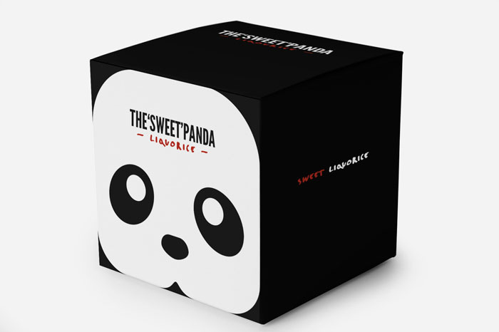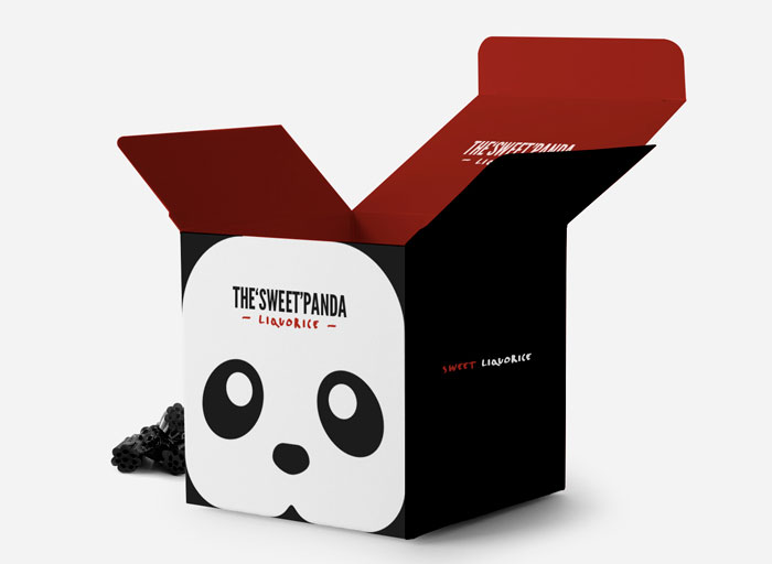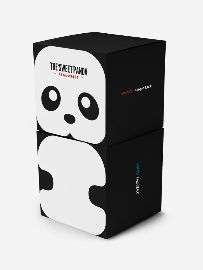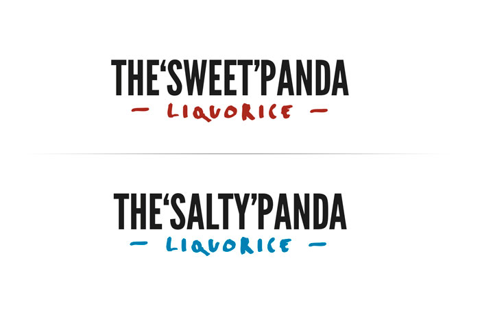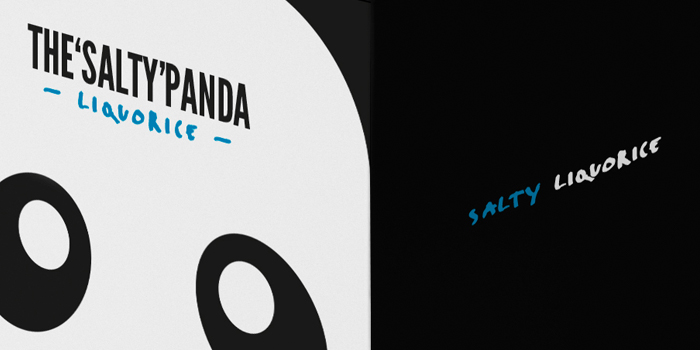
“A packaging redesign of Panda – a liquorice company. Panda is a world famous liquorice brand with a not so famous packaging/identity. Liqourice is for children and grown ups as well, so the design should appeal to both groups. I’ve tried to do that with the panda illustration combined with minimalism. The panda is for the children and the clean minimalism is for the adults. The idea with the box is that children can collect, stack and then build an tiny panda. I’ve made the two most common flavours: Salty and Sweet – which are the two most popular variations.
Designed By: Jonathan Faust