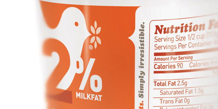
What a beautiful modernization of Friendship Cottage Cheese. I love how the logo has been merged into each individual SKU’s description.
“Friendship Dairies needed a way to reach 100% of their target audience. How? By bringing a little color and sass to the dairy case. With packaging becoming the new POS, especially when it comes to clean stores, we decided to amplify Friendship’s fun personality at the dairy case to a point where even their competitors’ consumers couldn’t help but love ‘em. With a sophisticated package redesign, Friendship was able to elevate their brand’s personality, as well as shopability—filling an unmet need in the cottage cheese category.