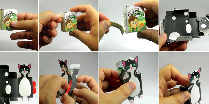
Featured image for Concept: TripTea

Concept: TripTea

by Gina Angie on 09/05/2012 | 2 Minute Read

Editorial photograph

Check out this beautiful packaging artwork that portrays the spirit of adventure and displays the richness of the tea flavors.

"At the heart of brand communication is the idea of traveling to exotic countries of the world, which gives us TripTea tea, and opens up a new world of flavor with each new package.

Since the brand, its communication and packaging were designed simultaneously, the semantic component was reflected in all cells at once. Naming the brand was based on two strong associations: first, TripTea is a tea travel, and secondly, TripTea tunes in the familiar and figurative word "triptych" - three-part painting, that completely reveals one key message in different subjects.

In developing the package, this principle also is embodied. We wanted to show the beauty, depth and fullness of the tea only. Therefore packaging was decorated with landscapes countries where it was assembled and produced. All landscapes are handmade directly from the tea variety in the package. This conveys an exotic image of the country as well as the richness of flavors and nuances of the product itself.


Besides the packaging reflects the meaning of the brand name - every sides of the package has one of the landscape of the triptych, that let you an opportunity to present the product at the point of sale in interesting and unusual way.

As a result, we managed to capture the spirit of adventure of tea, the flavor of traveling, show an exotic and unforgettable world of tea in all its colors."

Designed by Andrew Gorkovenko

Editorial photographEditorial photographEditorial photographEditorial photographEditorial photographEditorial photographEditorial photographEditorial photographEditorial photograph