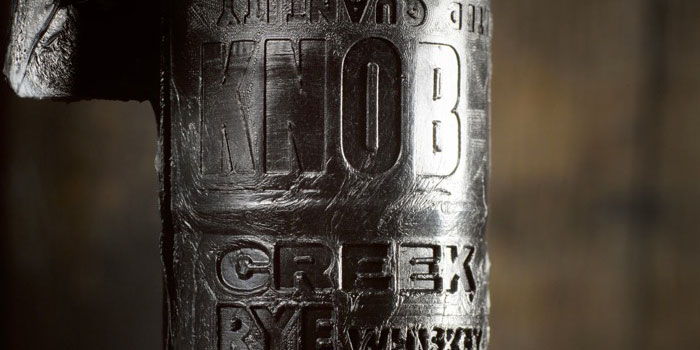
Packaging for small batch rye whiskey.
“Knob Creek Rye is the second extension to Knob Creek’s iconic lineup of handcrafted whiskies (the first was Knob Creek Single Barrel Reserve). The design for the original Knob Creek Bourbon was highly recognizable and considered legendary by the brand’s fan base, so design agency LPK’s work for the brand’s expansion, which includes Knob Creek Rye, was an exercise in restraint. To guide the design, LPK developed a set of hard points and soft points. For Knob Creek Rye, this hard point/soft point strategy maintains base brand equities, such as the asymmetrical layout of overlapping labels and upside-down newsprint of the original Knob Creek, but leaves room for distinct rye category color cues in the form of green type and a green side label overlaid against the deep black satin finish of the primary label.”


