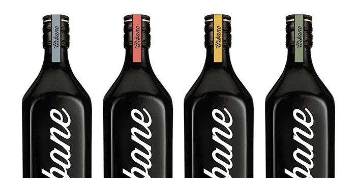
Concept: Urbane Scotch Whisky

Published


Urbcondiel716

Introducing ‘Urbane Scotch Whisky’ by Samuel McWilliams and Max Ostler. A project for the D&AD Packaging brief 2012.

The concept behind the brand introduces Whisky to the city, an area that it is not normally associated with. This refreshes and modernises the image of Whisky using themes that bring the product into the 21st Century. The city is seen as a place were people and cultures mix, reflecting the brand’s universal target audience and also the unique blend of Whisky. The meaning of the name Urbane is ‘sophistication and elegance,’ a reflection of the Whisky product as a whole. The name also adds the suggestion that the product is closely linked to its new urban market.

 

Urbane challenges the conventional image of Whisky, however, by using elements of the traditional layout of Whisky logos, information used on the bottle and the tartan pattern the brand is linked back to its very important roots within Scotland. The social aspect of modern drinking culture is promoted within the box and its features. The box packaging separates to act as a centrepiece, providing visual impact to any social occasion. The coasters that are removed from the top of the box allow up to four people to share the Whisky together.


Samuel Ross McWilliams [email protected]

Max Ostler [email protected]


Screen Shot 2012 07 16 at 3 37 19 PMScreen Shot 2012 07 16 at 3 36 37 PMScreen Shot 2012 07 16 at 3 37 31 PMScreen Shot 2012 07 16 at 3 37 07 PMScreen Shot 2012 07 16 at 3 36 55 PMScreen Shot 2012 07 16 at 3 37 46 PM

This placeholder is removed when the ad slot is configured.

This placeholder is removed when the ad slot is configured.

This placeholder is removed when the ad slot is configured.

This placeholder is removed when the ad slot is configured.

This placeholder is removed when the ad slot is configured.

This placeholder is removed when the ad slot is configured.