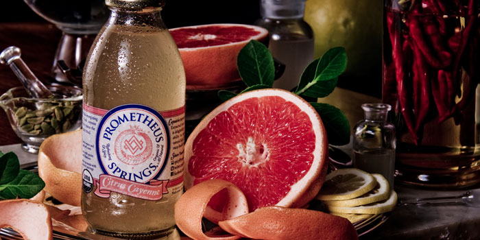
Featured image for Crit* Just In Case

Crit* Just In Case

by Tiana Spellman on 04/30/2012 | 4 Minute Read

Editorial photograph

Just In Case is an end-of-the-world survival kit and self promotional gift created by Mexico based advertising and brand design studio Menosunocerouno

"If the world ends this year, we better be happily ready."

Expecting a beautiful chaos, Menosunocerouno created Just In Case, the perfect brand for the end of times. A brand that covers all your basic apocalyptic needs. "Our survival kit re-packages a collection of iconic products from Mexico to enjoy in no particular order. The perfect gift for friends and clients (only the ones we want to keep). Modern Mexican design for the end of times." - Menosunocerouno

Editorial photographEditorial photograph

Menosunocerouno has appropriately avoided the cliched aesthetic of stenciled monospaced type and simulated wear common to the apocalyptic theme. Instead, a crisp, striking but fairly conventional utilitarian aesthetic has been achieved through the combination of a simple but contrasting two tone colour palette, sans serif typographic restraint, spacious layouts, lack of superfluous detail and a literal approach to language that makes this project initially quite compelling. Unfortunately this initial impact suffers from a lack of narrative, specific threat or context (real world or cinematic) and offers little in the way of depth either in the form of serious authenticity or as playful comment on society’s preoccupation with the fall of civilisation and subsequently self preservation.

GS_googleAddAdSenseService("ca-pub-3860711577872988"); GS_googleEnableAllServices(); GA_googleAddSlot("ca-pub-3860711577872988", "incontent1"); GA_googleAddSlot("ca-pub-3860711577872988", "incontent2"); GA_googleFetchAds();

GA_googleFillSlot("incontent1");

GA_googleFillSlot("incontent2");

The title ‘Just In Case’ is perhaps the strongest asset and offers a knowing wink to the shared understanding that the end of the world is certainly not nigh and the gifts should be enjoyed immediately but fails to resolve this ideas into a unique visual solution.The absence of a solid hierarchy, colour coding, mix of type and type weight, familiar or imaginative warning iconography, a juxtaposition of shapes in conjunction with repetitive content shows little appreciation for emergency design or an interest in storying telling. The utilitarian aspirations are lost to small type-size and straightforward formatting that together appear lackluster in contrast to the high visibility colour palette that delivers most of this projects impact however to its credit it does remain consistent throughout.The structural design is a simple practical mix of geometric boxes, stickers and tissue.

Editorial photographEditorial photograph

The ‘personal notes’ have the most appealing on-trend resolution but struggles to carry the hardwearing sensibilities you might expect from an authentic survival product or perhaps the creativity you would hope to get from something derived from a more theatrical origin such as a zombie, alien or environmental apocalypse. The tactile quality of the sticker and tissue combination does go some way to presenting the products as gift items and more importantly delivers a second level of engagement.

Survival kits are by no means an original concept as a vehicle for self promotion but in the past has provided plenty of room for creativity and original interpretation (see Bureau Bureau’s project ‘Pro Fema’ )-. Without a solid narrative foundation (either real world or speculative) Just In Case’s visual result appears one dimensional and while the product selection offers a small insight into the personal and regional favorites of the designers at Menosunocerouno it does not communicate anything more than a straightforward approach to design.

Editorial photographEditorial photographEditorial photographEditorial photograph

Opinion by Richard Baird

@richbaird