Featured image for Crit* Pepsi Next

Crit* Pepsi Next

by Gina Angie on 03/15/2012 | 3 Minute Read

Editorial photograph

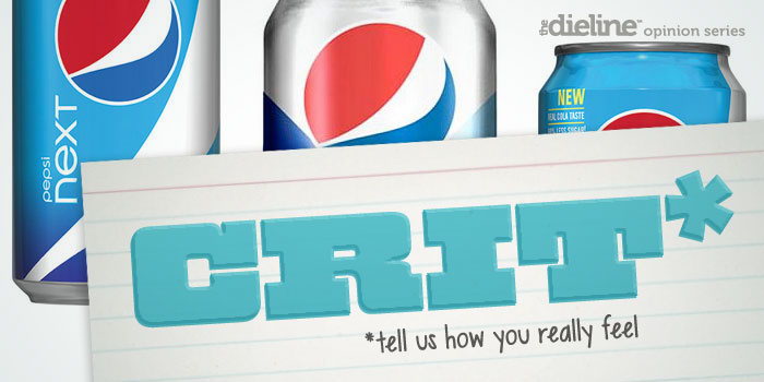
After hearing about the new Pepsi NeXT design we started the the conversation here. Below Richard shares his critque of the new can.

This March, soft drinks manufacturer and global brand Pepsi is set to launch Next, a new ‘mid-range’ cola that contains 60 calories positioning it between its regular and diet cola varieties. Next is Pepsi’s second foray into this currently underdeveloped category following the poor reception and discontinuation of the similarly positioned Pepsi Edge in 2005.

GS_googleAddAdSenseService("ca-pub-3860711577872988"); GS_googleEnableAllServices(); GA_googleAddSlot("ca-pub-3860711577872988", "incontent1"); GA_googleAddSlot("ca-pub-3860711577872988", "incontent2"); GA_googleFetchAds();

      GA_googleFillSlot("incontent1");

      GA_googleFillSlot("incontent2");

Editorial photograph

"The drink comes as people increasingly move away from sugary drinks to water and other lower-calorie beverages because of health concerns. It's also an attempt by Pepsi to revive the cola wars against Coke and others." via Huffington Post

Disregarding the ridiculous rationalisation of Pepsi’s rebrand conducted by the Arnell Group in 2008 (see their Gravitational Field document here), the new packaging solution, perhaps spurred on by Coke’s simplified, retrospective approach, delivered a far more distinctive and contrasting personality through a distilled packaging layout and proprietary typeface. This typeface, utilised across Diet Pepsi and initially Pepsi Max, helped to define a minimal and contemporary packaging philosophy with a blend of fine and consistent line weights, a crescentic geometric construction and a generous horizontal stretch. Next breaks this format by mixing curved and sharp terminals and junctions, cues from the Pepsi typeface and a upper-case lower-case contrast reminiscent of NeXT computers. Unfortunately this attempt to further customise what is a fairly conventional and dull typeface (only the ‘e’ feels truly proprietary) appears inconsistent, delivering neither a visually appropriate extension of the Pepsi brand or enough unique character (something Pepsi Max arguably now has) to define it as innovative or remotely ‘next generation’. For me a range of weights across the proprietary typeface would have perhaps been a more appropriate long-term and manageable direction for Pepsi’s frequently expanding and contracting product offering.

Editorial photograph

The introduction of a ribbon detail feels like an extremely strange choice considering the significant association such a form has with the Coca-cola brand. This alongside the logo-type adds more unnecessary inconsistencies and superfluous detail to what was originally quite a refreshing design.The new lighter blue and thin print treatment is a really nice choice that like the other varieties utilises the natural metallic qualities of the aluminum can. This really helps to reinforce the brand’s contemporary aesthetic and contrasts well against Coke’s classic approach. Unfortunately this is not likely to be as striking across the labels of the PET bottles but used in conjunction with a gradient (expanding on the black silver transition of Pepsi Max) should appropriately visualise its middle ground ‘blend’ and position it slightly outside of Pepsi’s core product range.Next might indeed hold more appeal to the consumer of 2012 but the visual translation of the middle-ground proposition (and perhaps cross gender aspirations) ultimately appears confused and unresolved. It neither sits comfortably alongside the Pepsi brand or as a personality of its own.

Opinion by Richard Baird

@richbaird