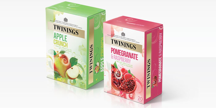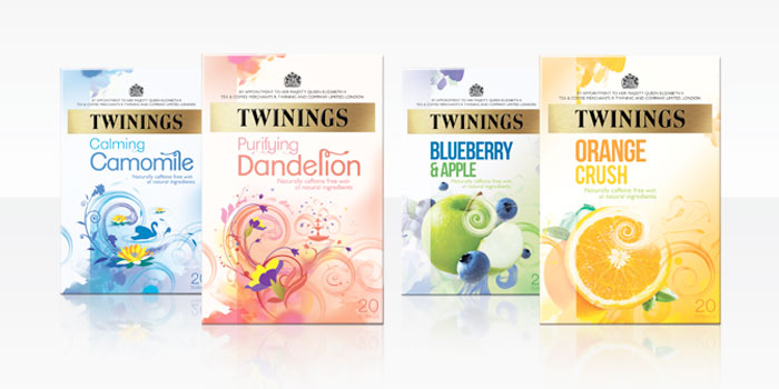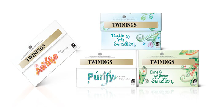
“Twinings tasked BrandOpus to simplify and redefine the architecture and pack design across the large Infusions range, with the ambitious objective of significantly growing category penetration. In response BrandOpus have introduced a clean, white background across all four sub-ranges within the infusions portfolio. Each blend also features swirling imagery to reflecting the moment that the tea infuses into hot water.”
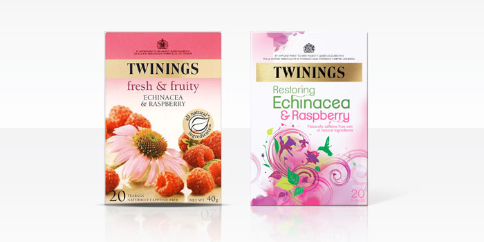
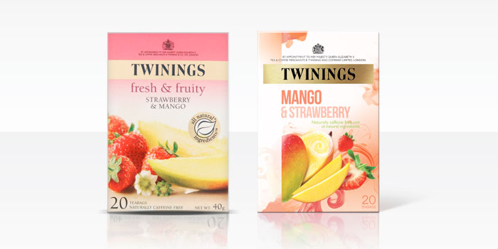
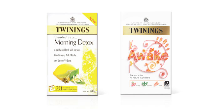
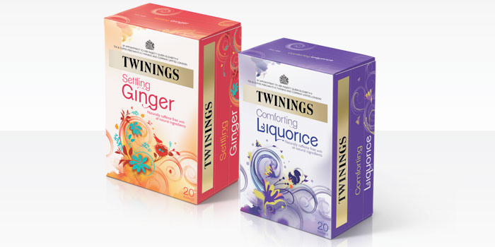
“The Fruit Infusions range uses bold typography, real imagery and illustrative touches to signify the hit of great flavour that the fruity blends create on the palette. Whilst Herbal Infusions use illustrative elements and accents of colour to signify the unique health benefit of each flavourful blend.
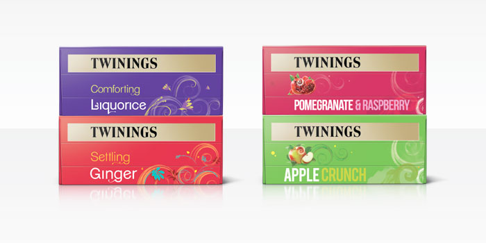
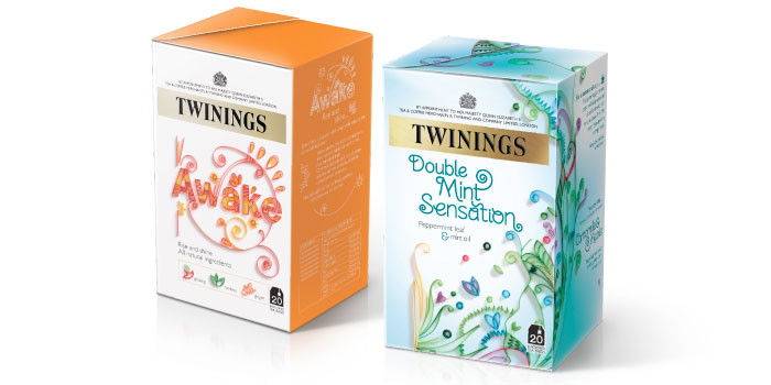
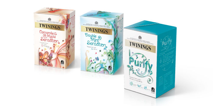
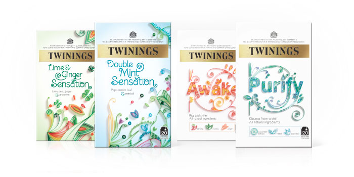
As part of the refresh Twinings are launching a new range of sensational tasting infusions, based on consumers favourite blends with an extra intensity and featuring interesting ingredients. Each variant has been developed by expert master blenders to ensure the depth of flavour matches the aromatic scent; combating the misconception that infused teas do not deliver on taste. BrandOpus communicated the distinctiveness of this special range through the pack designs, which feature an intricate quilling technique reflecting both the infusion process and sensational tasting notes of the teas.
BrandOpus CEO Nir Wegrzyn, says of the project, “Following on from the strategy we created for Green Tea, Twinings Infusions has been transformed from a fragmented portfolio to a simple strategy that is easy to navigate on shelf.”
Designed by BrandOpus, UK