Featured image for Crit* Glassbonden

Crit* Glassbonden

by Richard Baird on 10/17/2012 | 3 Minute Read

Editorial photograph

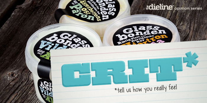
Glassbonden (Ice Cream Farmer) is an all natural premium ice cream brand that manufactures a variety of contemporary and traditional flavours using local, seasonal ingredients and extra fat milk produced by mountain cows on a farm located in the Västerbotten region of northern Sweden. Independent design agency Racer, led by art director Per Lindgren, was responsible for developing a name, visual identity and packaging solution for the brand that would reflect the small-scale family run venture and its combined farm and on-site ice cream production.

' > GS_googleAddAdSenseService("ca-pub-3860711577872988"); GS_googleEnableAllServices(); GA_googleAddSlot("ca-pub-3860711577872988", "incontent1"); GA_googleAddSlot("ca-pub-3860711577872988", "incontent2"); GA_googleFetchAds();

GA_googleFillSlot("incontent1");

GA_googleFillSlot("incontent2");

Editorial photograph

Based around the agricultural undertones of a bold slab serif - appropriately tempered by the imperfections of hand-finish line work and a rough pencil fill - Racer’s design solution is a smart resolution of industry (consistency), handcraft (batch quality) and locality (natural). The choice of a heavy typographic weight resonates well with the hearty, wholesome, nutritious extra fat qualities of the milk while its organic hand drawn construction has a child-like honesty ideal for locally sourced and natural ingredients.

The difficulties of laying out square type across a curved label results in a distinctive, playful, non-format approach and conveys a home-made authenticity. It is perhaps a little small and tight in a couple of places but this compact structure works well to suggest full flavour and plenty of ingredients.

Editorial photograph

The colour palette is vibrant but avoids appearing synthetic, is appropriately reflective of both earthy and sweet flavours while the pastel choices look sufficiently milky. Set over a black background, in conjunction with the chalk texture from the scribbled fills of the letters, these deliver a blackboard-like aesthetic reminiscent of farm shop and bakery sandwich signs that captures a sense of local industry. The dark tone also functions well to draw out the the lighter and natural tones of the ice cream through the walls of the pot. 

An organic die-cut adhesive label, presumably hand rather than machine applied, compliments the loose type and delivers a crafted contrast to the standardised form of an off-the-shelf pot - a practical and economical low batch choice - while a matt varnish adds a high quality and tactile finish. The repetition of content across the two tabs while simplistic (the absence of heritage of narrative is unfortunate) has a functionality that allows it to remain equally communicative either stacked on a shelf or at the bottom of a chest freezer.

Editorial photograph

It is a smart solution that manages to infuse the communicative qualities of rolling hills, cows, milk-pales and splashes into a more restrained type-only treatment and while it perhaps struggles to draw in the premium aspirations or heritage of the brand its combination of off-the-shelf structural choice and simple adhesive label is clear in its presentation of its batch-produced quality.

Opinion by Richard Baird

Editorial photograph

Richard Baird

Richard is a British freelance design consultant and writer who specialises in logos, branding and packaging. He has written for Brand New and Design Week, featured in Computer Arts magazine, Logology, Los Logos, Logolounge, The Big Book of Packaging and runs the blogs BP&O and Design Survival.

Twitter:@richbaird

Blog: BP&O

Portfolio:richardbaird.co.uk