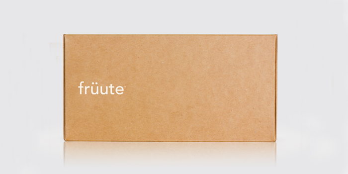
Search
Loading
Top Trending Posts
Newsletter
Featured Design Firm
FEATURED JOBS
« Student Spotlight: Cadbury's Chocolate | Main | The Dieline Conference: Call For Speakers »
Wednesday
Aug102011

Früute

Ultimately it's all about what is inside the box. "Ferroconcrete helped launch früute’s mini tart revolution by creating a comprehensive identity system that was applied across multiple brand touch points, including store design, interior and environmental design, website and packaging."

See the inner beauty after the jump! 

Like many of Ferroconcrete’s Identity systems, brand language and tone were created to enhance the brand’s messaging and personality. The design direction for früute uses an exceptionally clean, modern and natural aesthetic, creating an engaging and unique experience for a premium product that’s entirely unordinary." 

Designed by Ferroconcrete, Los Angeles

Reader Comments (3)

Very innovative! Great use of a die cut box!
08.10.2011 | Unregistered Commenterjordan
Portuguese makes clever use of the diæresis. As in many other languages, on the second of two vowels it signals that a diphthong is not formed; but on the first of two vowels it signals that one is.

(But, for all that I know, I'm lookin' at an umlaut here.)
08.11.2011 | Unregistered CommenterDaniel
I really love this package. Such a lovely elegant surprise!!
09.26.2011 | Unregistered CommenterJenny

PostPost a New Comment

Enter your information below to add a new comment.
Author Email (optional):
Author URL (optional):
Post:
 
All HTML will be escaped. Hyperlinks will be created for URLs automatically.
Related Posts Plugin for WordPress, Blogger...