Search
Loading
Top Trending Posts
Newsletter
Featured Design Firm
FEATURED JOBS
« Before and After: Boon | Main | Acrilex Decor Paint »
Friday
Jul152011

Lovely Honey

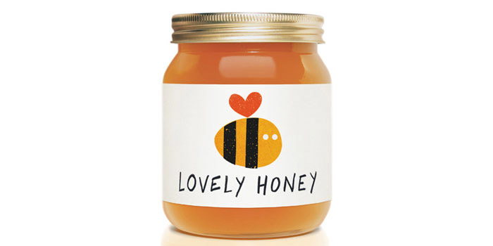
The identity uses a heart motif to reference both the name of the product and also the natural health benefits associated with honey.

A limited colour palette and hand drawn style helps create a simple, natural feel. The heart motif continues throughout across items such as secondary packaging and illustrations.

Thank you to Jamie Nash for submitting this project to us.


Jamie Nash HONEY1

Jamie Nash HONEY2


Reader Comments

There are no comments for this journal entry. To create a new comment, use the form below.

PostPost a New Comment

Enter your information below to add a new comment.
Author Email (optional):
Author URL (optional):
Post:
 
All HTML will be escaped. Hyperlinks will be created for URLs automatically.
Related Posts Plugin for WordPress, Blogger...