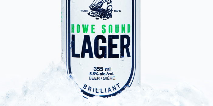
Featured image for Howe Sound Lager

Howe Sound Lager

by First name Last name on 05/17/2011 | 2 Minute Read

Editorial photograph

The packaging was inspired by the geography of the Howe Sound region of coastal British Columbia and the European explorers that first charted these waters.

"Being the southernmost fjord in North America, Howe Sound has verdant green mountains with snow-capped peaks rising out of deep blue glacial waters. This is represented in the colour scheme. The design itself honours maritime history, particularly old cartography which knew little of these mysterious waters perched on the edge of the earth and therefore filled them with sea monsters. The goal was to create a simple, bold and timeless looking can that respects and continues over a century of classic North American beer can design."

Designed by The Antidote.

Artwork and design assistance came from Also Known As in Vancouver, BC and Stacey Rozich in Seattle, WA. The 100% recyclable 6-pack topper was created by PakTech in Eugene, OR to our colour Pantone specifications.


Editorial photograph

Editorial photograph

Editorial photograph

Editorial photograph

Editorial photograph