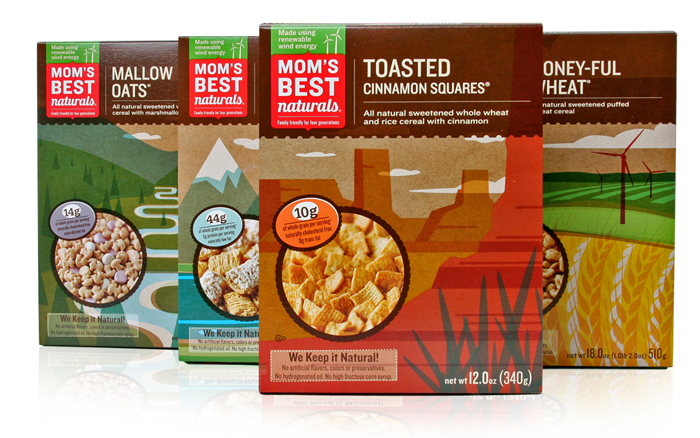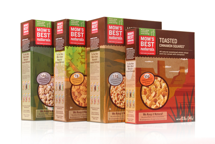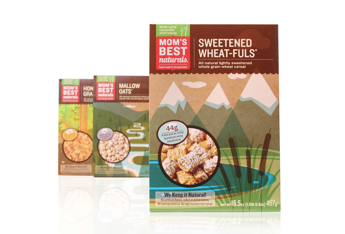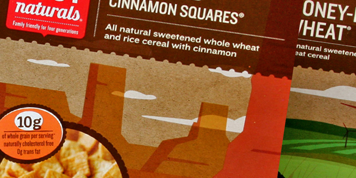
We love the scenic illustrations chosen for the boxes of Mom’s Best Naturals. They don’t only differentiate the brand from others on the shelf, they tell a story of the brand. Details below.
“The makers of Mom’s Best Naturals breakfast cereals recognized that their existing branding and boxes were impediments to growing their value brand’s retail footprint nationwide. Their existing boxes looked “low price,” but sacrificed brand equity, too.
HartungKemp’s colorful, illustrated redesigns reprioritized “quality” and “natural” to put them first in the client’s brand story. They also established emotional bonds and brand equity with cereal shoppers.
HK’s new boxes made an immediate impact on the client’s bottom line. The Mom’s Best Naturals sales force and distribution channels demanded an expansion of flavors even before the first new cereal box had gone into production. Retailers embraced the new look based on how it stood out on the shelf and how it engaged consumers.”
Designed by HartungKemp