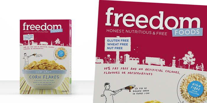
Featured image for Before & After: Freedom Foods

Before & After: Freedom Foods

by First name Last name on 03/02/2011 | 3 Minute Read

Editorial photograph

"Yello’s redesign of Freedom Foods was to reposition it from allergen food to better food for everybody. Even though it was a bold move, we made sure existing buyers would still recognize the primary equities of the brand. The mainstream cereal category in Australia is full of dishonest health claims and scientific jargon, our opportunity was to simply demonstrate to consumers that there is a better alternative and uncover what people are really eating."

GS_googleAddAdSenseService("ca-pub-3860711577872988"); GS_googleEnableAllServices(); GA_googleAddSlot("ca-pub-3860711577872988", "incontent1"); GA_googleAddSlot("ca-pub-3860711577872988", "incontent2"); GA_googleFetchAds();

   GA_googleFillSlot("incontent1");

   GA_googleFillSlot("incontent2");

"Through understanding Freedom Foods, we developed their philosophy (honest, nutritious and free) and expressed their story through an engaging identity.  The identity is a daisy chain illustration of their process and the care they take in growing and handling ingredients to delivering great quality with the benefits of eating and feeling better.

To communicate a better type of food we visually demonstrated the difference (salt/sugar/artificial additives etc.) comparing it to the leading brands and letting people make a clear and better choice.

Our design strategy was to create a system that was bold, friendly and familiar but clearly differentiated against the mainstream brands instore and across all touchpoints."

Designed by Yello Brands

Editorial photographEditorial photographEditorial photographEditorial photographEditorial photographEditorial photographEditorial photograph

Before:

Editorial photograph