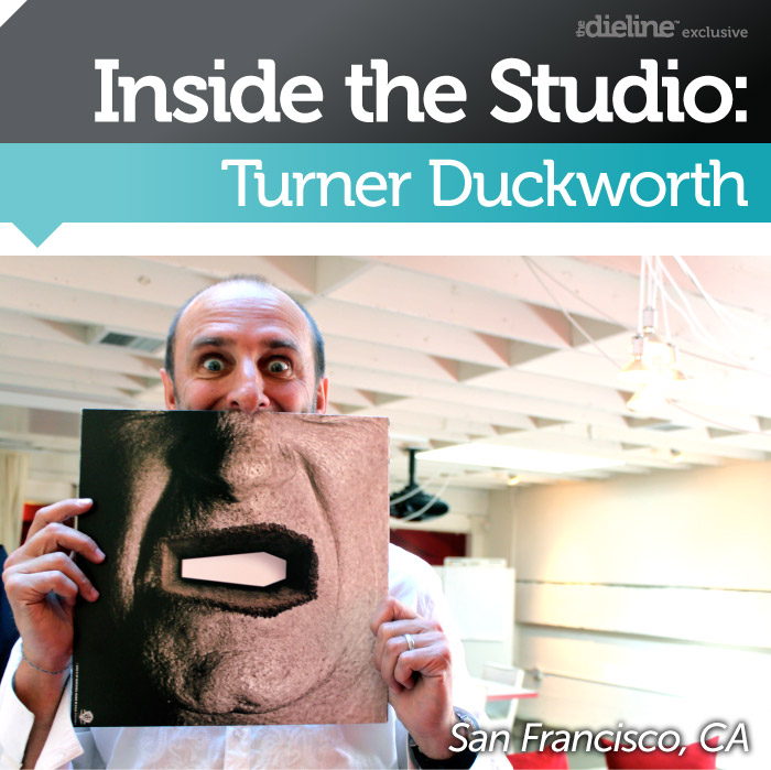
Inside the Studio: Turner Duckworth

Published

Filed under


02_01_11_AskTDHeader.jpg

If there was ever a high school dream date equivalent, Turner Duckworth would be ours. So, you can imagine how nerve racking our ride to the studio was. Wanting to make a great first impression, we were sure to recite our questions and do a double take to assure we looked our best.  Gleaming in the distance was the white façade bearing the unmistakable exclamation point logo of Turner Duckworth.  Having produced work for brands like Coca-Cola and Waitrose, and having won a Grand Prix award, a Grammy, and a lot of Dieline Awards, we were sure that what lay inside was nothing short of amazing.  We met with David Turner and Joanne Chan, Head of Design & Co-founder, and Head of Client Services, respectively.  Inside was a chic and –for lack of a better expression – SUPER COOL office with a killer rooftop view. We discussed everything from design, coordinating their dual studios in San Francisco & London, and of course – Coca-Cola. 


GS_googleAddAdSenseService(“ca-pub-3860711577872988”);
GS_googleEnableAllServices();

GA_googleAddSlot(“ca-pub-3860711577872988”, “incontent1”);
GA_googleAddSlot(“ca-pub-3860711577872988”, “incontent2”);
GA_googleFetchAds();

   GA_googleFillSlot(“incontent1”);

   GA_googleFillSlot(“incontent2”);

The “white façade” of Turner Duckworth Our tour began with conversation on the studio’s rooftop deck. 

David Turner: “Packaging, for a long time, had been the ugly stepchild in the graphic design world.  A lot of graphic designers, in some way, looked down on packaging, at least in America. In Europe it had gained a bit more cache but over here – certainly when I first came over – it was a real kind of journeyman of the business. You just got it done. Bang it out, put the features, the benefits, on the pack, and the nice picture of what’s inside.  It was very unglamorous.

I remember after college I did one packaging design project -in my whole degree course- and it was so bad I dropped kicked it out of the window the day that we presented. Somehow I ended up in packaging, which is something I didn’t expect.  Bruce [Duckworth] and I have always felt that packaging is so important,–in some ways the most important–it’s about communication.”

David Turner sits down with TheDieline

Andrew: What got me into packaging and into doing The Dieline is that it’s really the only tangible thing in graphic design. As a graphic designer, you can print a poster, do a website, do all these other things, but it’s the only tangible thing that can live in someone’s home.  You can literally take your design home and it’s sort of powerful if you think about it.

DT: “About 8-10 years ago – there were a lot of people saying ‘Packaging is going away, because no one is going to be shopping in stores anymore. They’re going to buy everything on the web, so packaging doesn’t matter’.  But actually as long as objects need to travel from one place to another, there will be packaging. It will always provide an experience for the consumer—so it will never ‘go away’.”

The view through the rooftop stairs reveals the Transamerica pyramid peeking through in the distance

Well… good [laughs] that’s good to know.

DT: “I think the reason why [The Dieline] got so much tremendous support from the community is because there are so many unsung heroes out there.   People are slaving away, doing such beautiful packaging design, and kind of being ignored.”

Andrew: And it’s never been recognized before. It’s never been put at that high level where it should be. 

Ivan:  And I think we have made it accessible—not just designers—but to a much broader audience.  I think people who aren’t designers are sometimes intimidated by design, and we have made it such an accessible thing. It doesn’t seem so foreign or exclusive anymore. Everyone can relate, because it’s about feeling a connection to the product you’re holding in your hand.

DT: “[The Dieline] doesn’t seem snooty.  I think part of that is attributable to you being young and enthusiastic and telling it like it is. It’s not about trying to come across as an authority.” 

Andrew: I wasn’t an authority when I came into it [laughs]

02_01_11_TD33.jpg

Some of Turner Duckworth’s work.

After navigating our way down from the studio’s roof, we were taken to a meeting area where the ever-impressive Cannes Film Festival Grand Prix and Grammy Award are displayed. 

02_01_11_TD2.jpg

DT: “The Metallica project was partly about the revival of vinyl.  Who knew that vinyl was making a comeback? We also designed the special collectible box set and all of the contents.”

Joanne Chan: “It sold out very quickly and then started selling on EBay for $1000, so it was pretty amazing. We did this on an unbelievably low budget.  There is a photo in the digipak of one of our account directors looking like she’s going to jump off the Golden Gate Bridge.  Jessica actually had 3 people come up to her and ask her if she was ok.

We did all of this in-house.  There is a photo of our production director looking like he’s coming off drugs.”

The Grammy winning Metallica packaging.

DT:  “[Photo of audience at concert] was a fan shot that we found on FLIKR from an actual Metallica concert. So this guy was just thrilled. We contacted him and said, we’ll pay you some money and you can be in the next album.”

That’s awesome.

JC: “This Grand Prix was a first ever that the Cannes advertising festival awarded to a design agency. It was 2 years ago.”

DT: “That was a big achievement to do this kind of iconic design for such mainstream brand like Coke.”

Tell me about all your work with Coca-Cola.  It’s incredible what you guys have done for the brand. 

DT: “It’s really kind of fulfilled our ambition, which is to do really great creative work for these really mainstream brands.  What you often see, and I’m sure you see this on The Dieline, is that a lot of the cooler design is for products and brands you haven’t heard of.  From a process point of view, it’s much harder to get really interesting work through with the big brands.”

Less people to have to say yes or no… 

DT: “Right. The main thing about Coke is that we hooked with a great team within the corporation, so it was that collaborative process that made this all possible.  When they first approached us, I was a little concerned because I knew it was going to be a big project, and if we couldn’t do great work for them, then it would suck the energy out of the studio.”

How do you get them to take that leap of faith into doing something?

DT: “I give a lot of credit to a guy named Pio Schunker – head of their creative excellence department for North America – who is the guy who originally hired us. I actually was very honest with him and said, ‘I’m really worried. I need to know that Coke is really committed to doing ground breaking design.’ And he said, ‘That’s what I want. For you to care that much about the quality of design.’ He specifically wanted independent design and advertising agencies working for him as opposed to the big groups.”

02_01_11_TD23.jpg

“Basically he and Moira Cullen, the Design Director at the time, really fought hard to get the design through, and we did a lot of work helping them explain the value of design to the business side of Coca-Cola. A lot of our presentations provided case studies about design and how it works. In answer to the question: How do we get to be like Apple, we actually deconstructed Apple’s identity to explain how it was working and then showed them how a new identity for Coke would work in a similar way. So it was like giving design lessons – it was fun.” 

Do you think that with a client as receptive as coke, who is willing to take a risk, it’s probably easier than having a client say, no you can’t do that. 

A plane made out of Coke cans, bought on Ebay by one of Turner Duckworth’s designers.

DT: “Oh yeah it’s impossible. When I go out and talk about our design process, I have a section at the end, which I call ‘The Key to Success.’ I save it for the end and I say, this is how you can make great work happen and I think everyone is waiting for my secret formula.  It just highlights the clients.  It says the only way you can do great work is if you have a client on the inside who’s advocating for great work and understands it.  That’s really the key to it all.” 

02_01_11_TD6.jpg

Grand Prix Award.

I read that 75% of your clients are just repeat clients that keep coming back. 

DT: “Liz Earle is a great example.  They came to us when they were just starting out.  That was about 15 years ago.  They were the largest independent beauty company in the UK and just sold the company to Avon. We designed everything for them all the way through, and Bruce actually became a sort of board member and consultant. Waitrose is another great example of a long-standing client. We have worked with them for 15 years.”

02_01_11_TD16.jpg

San Francisco + London times

What’s the process with working with both London and San Francisco?

DT: “It relies on individual connections between our staff members on each side.  We encourage our lead designers to share their work with the London studio while it’s in progress to get their input.  What we found is – if you formalize it too much, it tends not to happen, but if you get people to start building relationships it happens organically. Our Design Director, Sarah Moffat, worked in London for 8 years, and she’s been here for 3, so she creates a really strong connection.  I work with Bruce a lot, Joanne works with her counterpart, so it relies on individuals making the effort to connect.”

JC: “Part of our process that sets us apart is what we call our ‘distant crit’. It’s not “trademarked”, but it’s basically taking the design crit a few steps further. Our London studio sees the work before our clients do and vice versa. London is our biggest advocate and also our harshest critic, because their name is also attached to our work.  

So it adds this broader perspective and brings value to all of our work for our clients, and it’s great for all of our designers because they have someone looking out for them.  It’s also a reality check to make sure we are not just talking to ourselves.”

I heard that you guys swap out employees for an entire month in each city, is that correct?

JC: “Yes! In fact we’re about to do a swap, so the designers actually exchange desks – sometimes apartments. It gives designers an opportunity to absorb the other culture and further connects the two studios. [David] goes over about four times a year; I go about twice a year.  We try to make the connection more organic rather than spontaneous. David and Bruce talk every day.”

02_01_11_TD34.jpg

Left: The staircase as seen from the main level. Middle: Joanne shows us the “On Air” boxes at a designer’s desk, which let everyone know someone’s on the phone. Right: The stairs as seen from the “Man Cave”.

[David and Joanne then showed us some material that is given to prospective clients]

TD:  “This is a little book we made a couple of years ago, it’s Turner Duckworth A-Z.  We decided we didn’t want a sort of conventional brochure so we wanted something that was more of an attitude piece. The maximum anyone needs to spend reading this book is three minutes! On each page there is a letter, a symbol, a word, and a thought about a particular subject that is relevant to what we do.  For example ”H” is for “higher”: we are never satisfied, and we want to make our work even better. Aim higher!.”

02_01_11_TD28.jpg

David at work.

We were left to our own devices and allowed to roam the studio and its four levels.  We soon found ourselves in the basement level, appropriately dubbed “The Man Cave” by its –with the exception of one female designer –all male designers.  We discovered that the “Man Cave” was more than just a name, but also had a reputation to uphold.  Every day at noon, the male designers stop their work to have a push up contest. They are also active philanthropists, having adopted a bear at The Oakland Zoo –who goes by name of “Roberta”- and who funnily enough sends the designers “mail”.

02_01_11_TD18.jpg

The designers of the “Man Cave”.

02_01_11_TD17.jpg

The designers occasionally indulge in various activities like, ping-pong, push up contests, and in-office yoga.

02_01_11_TD24.jpg

Turner Duckworth’s Dieline Awards

02_01_11_TD29.jpg

We just had to.

Tanawat’s candy station

On the main level we met with designer, Chris Garvey, who created a website by the name of

Sticky Moments

, after his attempt to cheer up a co-worker sparked the idea for a blog. Another designer by the name Tanawat loved candy so much that Turner Duckworth set up a subsidized permanent candy bowl that Tanawat is in charge of filling for all the studio to enjoy.

All in all, our visit to Turner Duckworth was much better than we could have imagined.  Not only did we leave more inspired than when we walked in, but it was here that we decided to develop the interactive session for the 2011 The Dieline Package Design Conference, where you – our readers – submit your queries.  Bruce Duckworth and David Turner will address the chosen topics on Friday, June 25th 2011 at the conference.  If you would like more information on the session, visit

www.TheDieline.com/askTD

02_01_11_TD31.jpg

One last shot!

This placeholder is removed when the ad slot is configured.

This placeholder is removed when the ad slot is configured.

This placeholder is removed when the ad slot is configured.

This placeholder is removed when the ad slot is configured.

This placeholder is removed when the ad slot is configured.

This placeholder is removed when the ad slot is configured.