Featured image for Before & After: Nuun

Before & After: Nuun

by First name Last name on 02/17/2011 | 3 Minute Read

Editorial photograph

Having just redesigned the Seatle's Best Coffee brand, Creature redesigns another, Nuun:

"Nuun is a tab that dissolves in water to make a refreshing, electrolyte-balanced sports drink without sugar.  It’s easy to take anywhere and has fewer than 8 calories per serving.  The company was founded by endurance athletes who were dissatisfied with pre-made and powdered options on the market, and after nearly a decade it has become a widely loved hydration solution for athletes and active people around the world.?? As Nuun grows and aspires to keep more people hydrated, they face an interesting brand challenge: how do you preserve your integrity as a premium hydration solution and your heritage as a beloved brand, but open your benefits to a wider audience?"


The strategy for amplifying the benefits of the brand (without trading on its premium cred and personable style) was three-fold:

(1) Increase awareness beyond the usual suspects by enhancing the product’s visual appeal across the primary touchpoints (point-of-sale and on-pack) and building a website that clearly, visually serves up Nuun’s brand promise for a broader range of consumers – from low-key exercisers to high-octane competitors;

(2) Improve accessibility by remodeling the webstore and product SKUs for more convenient, ‘anywhere, anytime’ purchasing

(3) Invite loyalty by turning Nuun.com into a destination for Nuun’s dynamic offline community that exudes the whimsical, high-energy spirit of the brand.

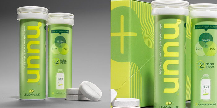
Creature helped Nuun craft a completely new visual and digital identity, brought to life through redesigned packaging and the totally renovated Nuun.com. The new face of Nuun amplifies the energy and vitality of the brand and makes the product’s advanced hydration science feel as easy as dropping a tab into water.  The redesigned Nuun logo gives form to the unique name in a flexible system anchored by the signature “electrolyte” N.  The new tubes simplify instructional elements with graphics and embody flavor cues through the bold use of color, making the product’s promise clear and friendly: “one up your water.”  The innovative packaging maximizes display space to create a modular, attention-snagging system for use in a variety of applications. And Nuun.com offers viewers a rich experience with the brand, inviting them to cross the digital threshold into the energetic community and constant adventure that define the brand. Dynamic content that informs and inspires, and inventive design elements that turn exploring the site into a refreshing experience in its own right, combine to make Nuun.com a destination viewers will want to interact with time and time again.

The new Nuun brand is set to roll out to the public in early February 2011 with the launch of Nuun.com and the unveiling of the redesigned packaging in specialty sports retailers and grocery stores around the country."

Designed by Creature

BEFORE:

Editorial photograph

AFTER:

Editorial photographEditorial photographEditorial photographEditorial photographEditorial photographEditorial photograph