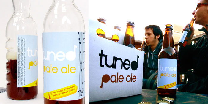
Top
 
Search
Loading
Newsletter
Latest Post:
Featured Jobs
Featured Firm

View All
Add Listing
Awards
The Dieline Package Design Awards - Presented by Inwork
Enter The Dieline Awards Now
« Student Spotlight: Rebranding Kmart | Main | The Vigneron Centenary Wine »
Tuesday
Sep072010

Tuned Pale Ale


"Tuned Pale Ale is a product by Philadelphia based designers Matt Braun and Chris Mufalli that explores the musical affordances in everyday objects and promotes social spontaneity. While drinking beer, people become musically encouraged and often start making start making music with objects around them. This product aims to promote more of this type of social interaction. Tuned Pale Ale helps to inform users about the musical qualities of existing bottles and to make the bottle a better instrument. A clearly marked graphic on the side of the label shows a user what notes can be played at certain levels of liquid by blowing across the top."

"The form of The bottle was also redesigned to help inform users of its musical affordance.  


Taking inspiration from the Guiro, a latin percussion instrument, ridges were added to one side and can be played with the cap. The neck is designed to be held comfortably between two fingers without slipping. With multiple people, Tuned Pale Ale becomes an ensemble of wind and percussive instruments.

The packaging was seen as an opportunity to create a memorable keepsake and a unique instrument. When turned upside down, this limited edition holder is a tongue drum that produces six different tones. This compliments the bottles and makes Tuned Pale Ale into a fun, easy to use, music making kit.

To date, only a small batch of microbrew was produced and sampled with great success. Tuned Pale Ale is currently seeking larger brewing and distribution options."


PrintView Printer Friendly Version

EmailEmail Article to Friend

References (1)

References allow you to track sources for this article, as well as articles that were written in response to this article.

Reader Comments (12)

A pretty dire execution. Seriously, how much standout will type on light blue give... look at your own pictures.
September 7, 2010 | Unregistered CommenterNeil
agreed. the design is horrible
September 7, 2010 | Unregistered Commenterjohn.q
Seems like they put a lot of thought into the bottle and case design. But very little into the label. So much more could have been done with it. I like the idea of during the "d" into a music note, but you don't even notice it.
September 7, 2010 | Unregistered CommenterJeff Chapman
Thank you for taking the time to give feedback. What you see there is just the prototype. Not bad though for some guys that don't specialize in letterform or graphic design! We actually wanted the 'd' to be a very subtle thing so it did not call too much attention and a lot more time will go into the label when it goes into production. YES, a lot more time was spent on physical design and prototyping.

But really John Q...Horrible?! Maybe you'd care to share your work or something more positive to back up your statement.
September 7, 2010 | Unregistered CommenterMatt Braun
no, he's right. it's bad. like, first semester art school bad.
September 7, 2010 | Unregistered Commenterfowler
Musical beer bottle. Awesome idea. Very +.
Im curios to see how it works.
September 8, 2010 | Unregistered CommenterIvan Gurkov
Sorry Matt but it is kind of horrible for lack of a better phrase. People become musically encouraged while drinking beer? I just don't get the relevance. Idea / execution / styling... it's all lacking. Unless there is a new trend in Philadelphia? for me beer is about relaxing... not turning the bottle into an instrument, too much effort for something a little boring. I would be amazed if this makes it into market / distribution but then stranger things have happened! Good luck!
September 8, 2010 | Unregistered CommenterNeil
Yeah, this is why you hire a designer. The design really is pretty bad. At first I thought it was trying to be ironic-- but then I realized after reading this post that it was just bad. Plus points for thinking of a good re-use for the bottles.
September 9, 2010 | Unregistered CommenterChris
An interesting idea, but unfortunately it should have been left as an idea.
September 19, 2010 | Unregistered CommenterCharles
HATERS GONNA HATE. Don't listen to 'em dawg. It looks totally great in a hipster / beer drinker sort of way. I love IPA's, you guys really have a great idea going. Keep up the hard work!
February 26, 2011 | Unregistered CommenterVenditta
I think Ivan's being a bit too subjective here. Music and beer have always gone hand-in-hand... ever heard of "drinking songs?" I can see my group of friends playing around with these, easy.

While I like the bottle and wood packaging design, I agree that the labels need some work-- I think that the "play notes" arrow could be better integrated. Maybe you could try repeating the colors on other parts of the label? The way it's cut off at the bottom is sort of odd, too.
March 15, 2011 | Unregistered CommenterAnnie
I actually like the idea. Yes, the label could use a more professional and cooler look, but that has little to do with the original idea that is presented here. I bet the people calling this idea horrible are very good at designing a better label for you ;-)
March 22, 2011 | Unregistered CommenterBen

PostPost a New Comment

Enter your information below to add a new comment.
Author Email (optional):
Author URL (optional):
Post:
 
All HTML will be escaped. Hyperlinks will be created for URLs automatically.