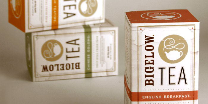
Search
Loading
Newsletter
Latest Post:
Featured Jobs
Featured Firm

View All
Add Listing
« Brilliant Beirut. | Main | Thank You to Our Sponsors! »
Thursday
Aug052010

Student Spotlight: Bigelow Tea

"The project was to create two different designs for one product. Bigelow tea was chosen to be repackaged for two different target audiences: an upscale gourmet store, and a lower end retail store. The upscale design pushed for interesting structure and modern design, while the low end version had to be considered for mass quantity production while still having visual appeal."

"The packaging needed to appropriately reflect what was being sold. Both concepts had to compliment one another, while being able to stand on their own as a unique product. Complete background history of the company, target audience, and competitors had to be researched along with many store audits. after many nights of steeping and countless cups of tea, Bigelow had a fresh new face that remained true to it’s philosophy."

Designed by Kristen Haff, a soon to be graduate at the Academy of Art in San Francisco.

PrintView Printer Friendly Version

EmailEmail Article to Friend

Reader Comments (6)

Nice execution, but the letter spacing seems a bit off in the word BIGEL O W.
Still, thumbs up
August 5, 2010 | Unregistered CommenterSven
Both these ideas look like great solutions to the brief you described! Your lower-end design still manages to retain an air of sophistication.
August 5, 2010 | Unregistered CommenterBenjamin
Well done! But why the full stops?
August 5, 2010 | Unregistered CommenterGabrielle
Wow, you work @ FB now!!?!
August 6, 2010 | Unregistered CommenterJack
this looks so much better than the original packaging!!
August 9, 2010 | Unregistered Commenterirene
Overall very nice. I like that you kept the teapot icon, but it could be played up more in the loose tea packaging.
The boxes appear to take too many visual cues from Tazo tea packaging. On these, the part that needs the most work is the main icon/name area; those three elements don't work together as nicely as they could. Perhaps reconsider the typography a bit?
But as I said, well executed and very nice overall.
August 10, 2010 | Unregistered CommenterA. Designer

PostPost a New Comment

Enter your information below to add a new comment.
Author Email (optional):
Author URL (optional):
Post:
 
All HTML will be escaped. Hyperlinks will be created for URLs automatically.