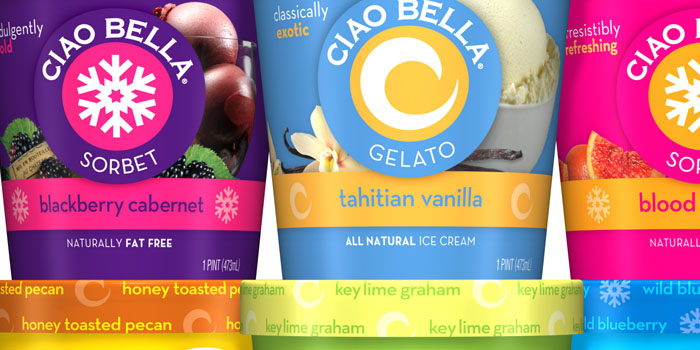
Top
 
Search
Loading
Newsletter
Latest Post:
Featured Jobs
Featured Firm

View All
Add Listing
Awards
The Dieline Package Design Awards - Presented by Inwork
Enter The Dieline Awards Now
« Tequila Malafé | Main | Amelia Park Core »
Tuesday
Aug032010

Ciao Bella

"Ciao Bella’s gelato and sorbet are super-premium products. As part of a category that often confuses consumers while competing with major ice cream players, the packaging needed a facelift."

"Partnering with Tailford Mitchell, Ciao Bella launched a redesigned package that helps consumers define the contents without losing any brand equity. Bright colors remain a staple and now the product receives more emphasis."

Before:


PrintView Printer Friendly Version

EmailEmail Article to Friend

Reader Comments (18)

Hmm. I actually really liked the packaging before (their coconut sorbet is magic) and even hung on to one of the lids. The simplicity, for me, is what made them stand out, though I realize I do see the world through a designer lens. Now it looks a bit more like every other package—not everything needs a facelift...
August 3, 2010 | Unregistered CommenterAnn-Marie
Whoa... Actually I preferred the simplicity of the Before designs. When our company had an ice cream client a year or two ago, we picked up Ciao Bella as part of our competitive set research, and we really enjoyed their bold colors and stark, simple design. I think the new horizontal band and flavor cue imagery kind of messes that up... I do think the new design does a good job of strengthening the branding, though, and clarifying the gelato vs. sorbet communication.
August 3, 2010 | Unregistered CommenterKristan
I like the "before" better :(
August 3, 2010 | Unregistered Commenterrct
Gotta say the original packages have been a favorite of mine since I seen them last summer. From a design perspective, this packaging didn't need a facelift. They were different, now they're similar to all their competitors. Is that really a good thing?
August 3, 2010 | Unregistered CommenterFred D
I prefer the simplicity of the previous design as it stood apart from others in terms of "artisan" products and brand identity. I just saw this product yesterday at the supermarket and was thinking how it stood out from other products. As one of Dieter Rams principles of good design , "good design is unobtrusive." I agree with Ann-Marie's comment, not everything needs a facelift!!!
August 3, 2010 | Registered CommenterTere
The new work by Tailford Mitchell is a dramatic and most delicious improvement on the old design. In it is not even close in my mind and my bet is consumers will confirm their adoration with more new purchases for Ciao Bella. The old design hides and fails to communicate much beside being another fruit driven pint-sized frozen dessert. The new-look Ciao Bella is proud and beautiful like her name. Never tasted the products. Now I can't wait to go to the market and purchase Key Lime Graham and Blackberry Cabernet to discover if the actual product is as magnificent as the new packaging.
August 3, 2010 | Unregistered CommenterLee S.
agreed. the before design is miles better than the redesign. its very busy now and starts to look like the competition. it feels cheaper. to top it off the photography is awful!
August 3, 2010 | Unregistered Commenterjohn.q
not sure about the blood orange flavor, heh
August 4, 2010 | Unregistered CommenterPat
Posting again—there was something amazingly old-school about the simplicity on the old packaging. That is completely lost now. And I agree, now it looks busy, and cheaper because of it. I get that it's meant to be communicating more with the photography, but surely people can read flavors? I didn't think it "hides" at all, Lee. The minimalism and interesting color combinations made for a lovely color palette behind the fridge door. Who knows, maybe it'll be a hit with the masses, but I'll feel cheated every time I pick up a new-designed pint. Rarely do I love packaging as much as I did their old design!
August 6, 2010 | Unregistered CommenterAnn-Marie
I also found my eye lingering on the clean and simple before packaging and was glad to see most people shared my thoughts.
August 7, 2010 | Unregistered CommenterMay
The new design is not so powerless, it needs some small changes, also in my opinion the tahitian vanilla has a poor colors.
Plus the old cap text is much better.
August 7, 2010 | Unregistered CommenterAbdo
I must join the chorus liking the before. I've loved this brand since I first saw them several years ago, both for the design and the flavor. John, the blood orange is to die for; absolutely amazing.

I am glad they moved away from the plastic packaging, but am quite disappointed with their new graphic direction. It no longer feels like a premium brand.
August 9, 2010 | Unregistered CommenterKelly
yeah. the new look feels a bit out-dated already.
August 17, 2010 | Unregistered Commenterakrok design
I must agree with all the "like the BEFORE"! It's lost its uniqueness and simplicity in a sea of mass produced ice creams and sorbets. The first time I discovered Ciao Bella I loved the minimalist design, color palette, the stark beauty of it. It really stood out. Can't say it does that anymore.
August 18, 2010 | Unregistered Commentercarol
Blackberry Cabernet is that crack!
September 8, 2010 | Unregistered CommenterJoshua K.
Wow I coudn't disagree more, I think the new design really pops off the shelf. Then again I have a prejudice against overly minimalist package design. If your entire mechanical was done in illustrator using a clip art snow flake with a final file size of under 1 MB you just aren't doing your job.
September 9, 2010 | Unregistered CommenterPixel monkey
Don't like it at all, the fake photos ruin my fantasy of what is inside. I am an afficianado of ice cream/ sorbet - why would an advertising firm force appetite appeals down my throat? Part of the desire for this kind of treat is the imagination, the fantasy, the dream of the first spoonful, we don't need bad photos. I love the old graphics they are sweet and dreamy like what is inside. Constant upgrades are not always necessary. I look at the upgrades to breyers, pepsi, and gap logos over the past couple years and am disappointed by the "let's do something new" marketing cycle. Change for changes' sake is silly. Scoop pictures were cool a while ago, now they're beginning to undermine the consumers sensibility.
December 29, 2010 | Registered Commenterbety draper
The before packaging was so much better. Simple bold colours is exactly spot on. I don't see how file size would make a design more or less appealing.
July 21, 2011 | Unregistered CommenterGinny Tran

PostPost a New Comment

Enter your information below to add a new comment.
Author Email (optional):
Author URL (optional):
Post:
 
All HTML will be escaped. Hyperlinks will be created for URLs automatically.