Top
 
Search
Loading
Newsletter
Latest Post:
Featured Jobs
Featured Firm

View All
Add Listing
Awards
The Dieline Package Design Awards - Presented by Inwork
Enter The Dieline Awards Now
« Epullen | Main | The Dieline's Latest Top 10 Package Designs »
Wednesday
Aug252010

Designer Milk Packaging

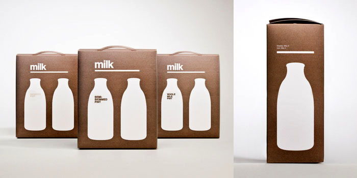
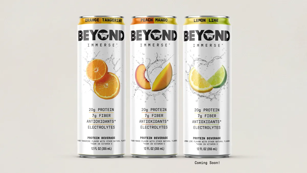
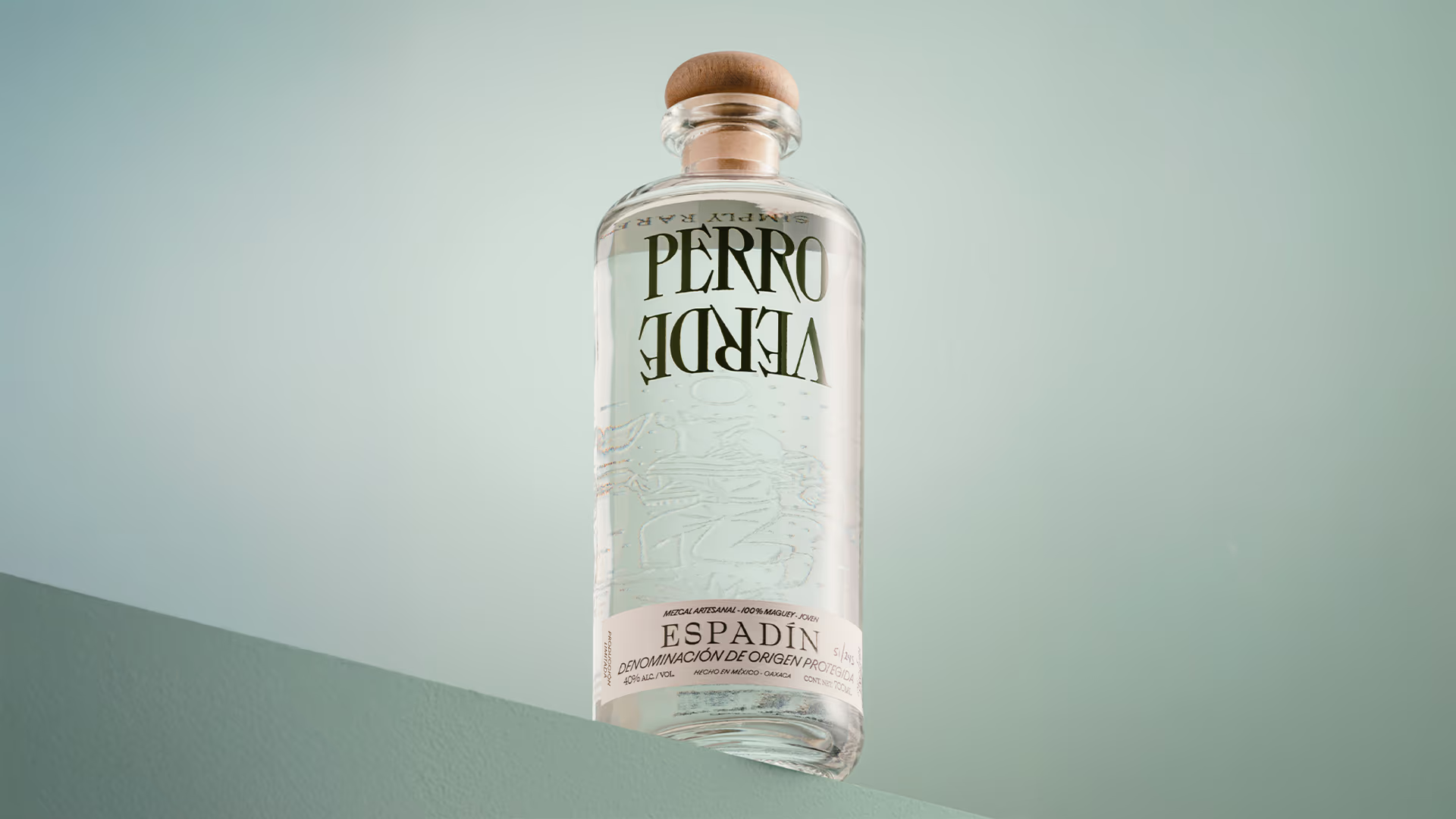
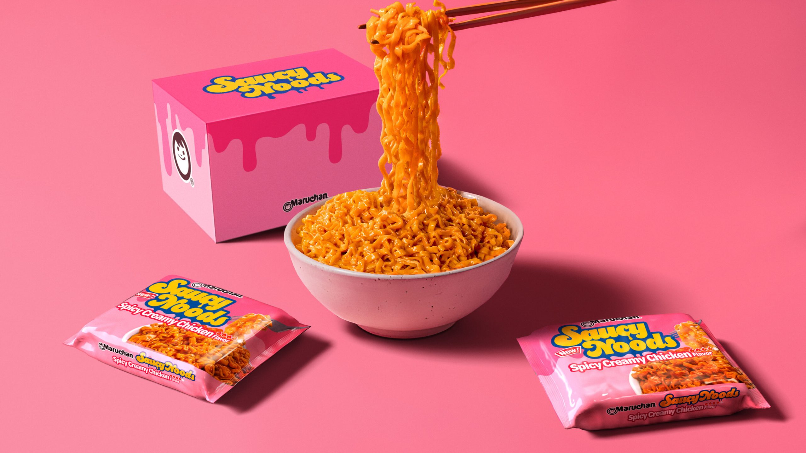
New work from UK based Darren Custance, check it out below.

PrintView Printer Friendly Version

EmailEmail Article to Friend

Reader Comments (7)

This is nice clean design, however I feel that the box becomes a little wasteful. Of course you can recycle it, but why have something to recycle at all when it isn't necessary.
Shouldn't the retail and shipping companies be using racks and carts that can be re-used and not relying on the packaging box to transport the item?

Again, this is very clean and simple design. I understand what the boxes contain and can find the relevant information quickly. In that regard the design is successful.
August 25, 2010 | Unregistered Commenterw.n.
very nice design.
more convenient for customer, can buy as a gift in some case.

btw, agree with w.n.
August 26, 2010 | Unregistered Commenterleft•it•behind
yeah it looks good but so what, anybody can do silhouettes of bottles and print on nice paper. Theres no idea behind it, and obviously no client, meaning there were no objectives, meaning the design is unecessary... design for the purpose of design is useless and wasteful
(i maybe a bit harsh but thats what i think without sugar coating it)
August 26, 2010 | Unregistered Commenterjay
design for the purpose of design? I don't even
August 26, 2010 | Unregistered Commenterdiex
I don't think there's anything wrong with designing for design's sake. There's nothing wrong with keeping your skills sharp and trying something different.

However I have to agree, the lack of a client or real constraints hurt this design, it's impractical in almost every way. There is excess packaging and any client would require more than "Milk", why not invent a generic brand. The minimalism implies pragmatism but the design isn't practical at all.
August 26, 2010 | Unregistered CommenterCraig
so tell me then, what was the goal for this design? is it to communicate clearly to consumers that there are 2 bottles of milk inside? people already know what milk looks like..
don't get me wrong, i think it looks like.. but i don't see that it solves any problem and yet producing it costs money, time and resources... therefore i don't see the need for it
August 26, 2010 | Unregistered Commenterjay
No matter how you cut it Milk is animal abuse.... I am sick of all the marketing ads for Milk and Dairy (made by happy cows.... blah, blah, blah) you wouldn't be happy if you were ripped apart from your mother after 24 hours of birth so that humans can steal the milk that was meant for the calf!!!! Mother cows cry out for their babies for days and days.... it's horrible to watch!
August 31, 2010 | Unregistered Commenterclare

PostPost a New Comment

Enter your information below to add a new comment.
Author Email (optional):
Author URL (optional):
Post:
 
All HTML will be escaped. Hyperlinks will be created for URLs automatically.