THIS IS IT! DIELINE Awards 2026 Late Entry Deadline Ends Feb 28
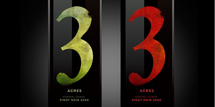
“The design brief was to create an iconic label that had could transcend across all of their wines. Central Otago, is an extreme climate which experiences a hot and dry climate in the summer and a freezing, snowy winter.”
“The identity of this label is rich and gritty, blistered and burnt – reflecting the suffering seasons of the Central Otago region. The water colour also pays tribute to the infamous ‘painted’ area.”
Get unlimited access to latest industry news, 27,000+ articles and case studies.
Have an account? Sign in