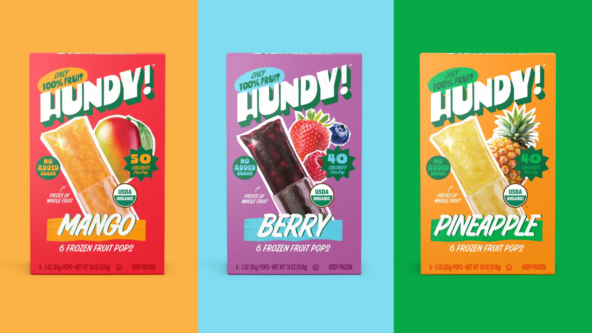
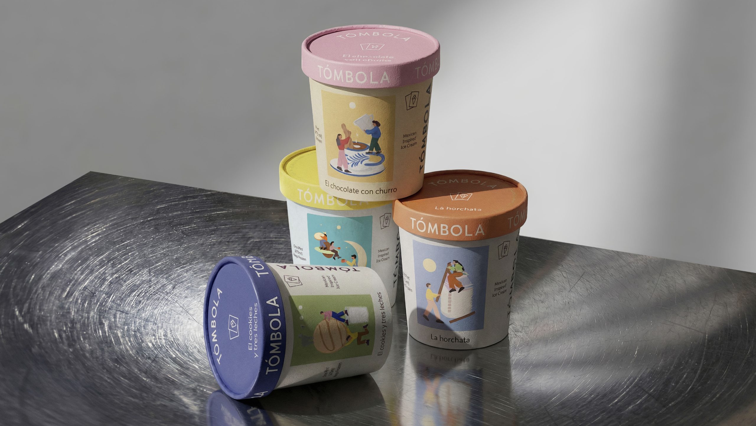
It happened again. Another aesthetically pleasing package worthy of the Dieline has been pulled from the shelves of the supermarkets across the country for poor sales performance.
This time it Kraft cheese. It was a design generally held in high regard. Within my firm, designers have frequently featured it as scrap or within mood board shown to clients during the concepting phase of the design project. It not only served as design inspiration, but also as a little nudge to the client to say “Look! Your competitors get it. More and more they are willing to take a risk and put well-designed packaging on the shelf.” Unlike it predecessor, this cheese package design had no shmaltzy, patronizing, optimistic script lettering in which the designer at the helm must have defaulted to sending out for a calligraphy instead of studying and refining ownable letterforms. The Kraft cheese design was, I thought, refreshing, elegant and minimal. The typographic treatment was coolly understated. The design was also significant to me because it symbolized a CPG industry-wide shift in the perception of effectiveness of design in solving business challenges. The largest CPG companies like P&G and Kraft are finally catching on to that which we designers have long presumed—good design matters and its not to be regarded as the end-stage afterthought to be grouped with box substrate selection and printing technique where focus is on saving a few extra pennies in operational costs.
Along with the bold redesign of Back to Nature and Kraft Dressing, this cheese redesign was to further demonstrate Kraft’s emergence as the next progressive company to leverage design as the strategy for marketplace dominance. It was a shock when the cheese packaging was pulled and then replaced with something apparently more mundane and uninspiring. One can only speculate what spawned the shift. Out of curiosity, I purchased a few of the remaining packs of the now discontinued design.
