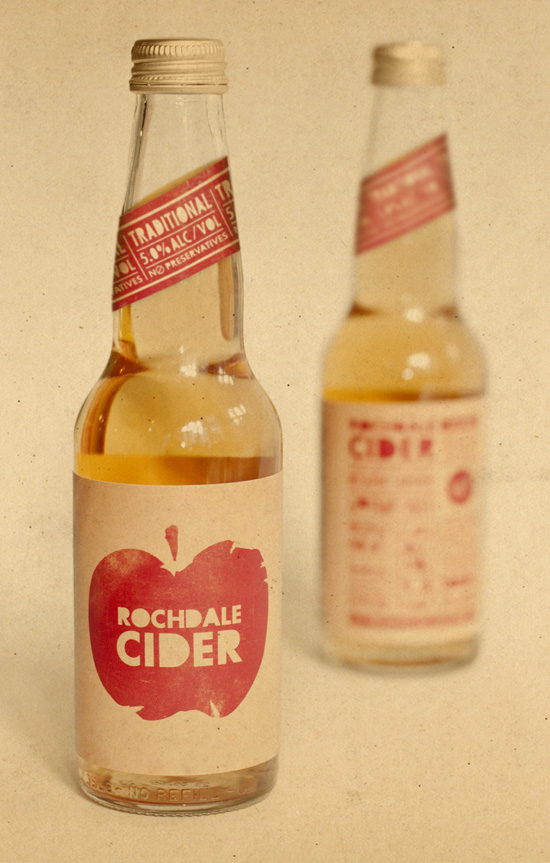
New Zealand based Supply revives an old classic. Check out more after the jump.
“The McCashin family asked Supply to revive Rochdale Cider, one of its original brands from the 1940s. Rochdale was, and still is, produced by a local orchard and brewery in Nelson, New Zealand. The family wanted Rochdale to represent history and tradition, but feel fresh and new within the growing cider market. So the brand, packaging and collateral needed to communicate a “retro cheek” that referenced its heritage but captured a modern audience. ?The iconic apple brand mark was developed, with its stencilled lettering – a visual reference to the fruit stamps many of us created as kids. This felt nostalgic, while graphically communicating the essence of the product. Copy and typography complement each other and give Rochdale an aesthetic voice. The typographic layout and hierarchy of messaging reference old boxing posters and newspaper ads, matched by the authentic textures of antiqued paper and screen printing. Its strong shelf appeal has been a key element in Rochdale’s success. Feedback has been great as people experience the brand and relate to its fun, retro character.”