Follow:
  News:  
 
Follow us on Twitter
Subsribe to our Feed
Our Feed via Email


View More Jobs
| Post a Job


Search The Dieline
« Studio Spotlight: Heidi Chisholm/Extra Fancy | Main | Compagnie de Provence limited edition soaps by Stephen Muntaner »
Thursday
Jun102010

Miller High Life Redesigned

1

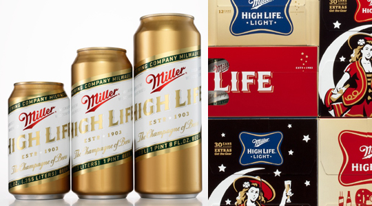
Landor San Francisco has just launched a brand new packaging program for Miller High Life. 


"Once the flagship brand for Miller Brewing Company, Miller High Life had over time been repositioned as a below-premium beer that belied both its product quality and rich 100+ year-old heritage. In order to improve consumer perception, we contemporized and better leveraged its revered and iconic brand elements—the Miller High Life Soft Cross and the Girl in the Moon. The new visual identity allows the brand to stretch beyond the below-premium category into a more premium territory that we think positions the brand to reclaim its iconic status."

Client: MillerCoors

Firm: Landor San Francisco

Creative Director / Design: Tosh Hall

Art Director / Design: Andy Baron

Miller_HighLife_003

Miller_HighLife_004

Miller_HighLife_005

Miller_HighLife_006

Miller_HighLife_007

Miller_HighLife_008

Miller_HighLife_009

Miller_HighLife_010

Miller_HighLife_012
 

Reader Comments (35)

Great to see my favorite cheap beer get the packaging it deserves.
June 11, 2010 | Unregistered CommenterThomas Nelson
No crazy about the woman on the moon having such a high prominence on the pack, but I love the rest. I especially like the side of the pack that has the old newspaper style graphic, thats really cool. Nice and simple, thats where packaging is going these days. Except for my clients that is ;)
June 11, 2010 | Unregistered Commenterjeff
Hard pressed to say that Landor can claim ownership over this work. These concepts, and in some cases executions, have been circulating in various forms authored by a few different agencies, including: Ogilvy BIG, Desgrippes Gobe NY, and others. The end result is nice, but I imagine more of the effort was spent convincing the client the solution was correct, versus the actual development of the creative work.
June 11, 2010 | Unregistered CommenterDH
Since taking office as Argentina national team coach has always nag at the sidelines to show the image of sportswear, his argument is: "sportswear make yourself feel comfortable, Adidas Jeremy Scott Shoesconvenient office ran the sidelines, or dancing." But , his two daughters on the father's image really stand most of the time with Diego Maradona then called his father wearing a business suit is recommended when appearance. "Quickly take off the bloated body of sportswear it." Dharma and Jiyanina turns persuasion.Since taking office as Argentina national team coach has always nag at the sidelines to show the image of sportswear, his argument is: "sportswear make yourself feel comfortable, convenient office ran the sidelines, or dancing." But , his two daughters on the father's image really stand most of the time with Diego Maradona then called his father wearing a business suit is recommended when appearance. "Quickly take off the bloated body of sportswear it." Dharma and Jiyanina turns persuasion.
June 12, 2010 | Unregistered Commenterbuyeasyshop
The day I saw this packaging I went out and bought a 30-pack. That's 30 opportunities to just stare. And have a beer. I love this one!
June 14, 2010 | Unregistered CommenterTodd Weber
I love this. Love love love it! I wish Miller would release these images as desktop wallpaper. I shall now investigate to find out if they have.
June 15, 2010 | Unregistered CommenterSamrdbarnes
Very nice bravo
June 16, 2010 | Unregistered CommenterKate
I'm glad it still LOOKS like High Life.

Now, if only I could find the tall cans around here! (High Life was my beer of choice in and immediately after college. I've since moved on to drinking whiskey and soda out of a vintage yellow High Life highball glass.)
June 16, 2010 | Unregistered Commenterkatey
I love this redesign. It manages to look elegantly retro and modern at the same time.
June 17, 2010 | Unregistered Commenteraburtch
I think getting rid of the tag line "The Champagne of Beers" would help improve it's image of a below premium beer. The tag line sounds like they are joking about themselves.
June 21, 2010 | Unregistered CommenterCraig
ah so nice but still holding onto all the important elements of the brand.
June 21, 2010 | Unregistered CommenterKate
I have to admit that they actually did a very good job. It looks like Miller listened to some very good advice and Landor followed through with some excellent design work. It's unfortunate that Miller tastes like every other cheap beer/water out there. I will still support all of the great micro brews out there creating truly spectacular beers that could use some redesigned brands as well.
June 21, 2010 | Unregistered CommenterGreg
Treat yourself to a twelve pack of longnecks and put the bottles in front of the light in your fridge. Beautiful.
June 23, 2010 | Unregistered CommenterThe Officiel Office Of
made me switch from PBR. Pretty successful I think.@Todd Weber, same deal. The first time I saw it I went through a case over one weekend.
June 28, 2010 | Unregistered CommenterMick
It's still Miller High Life. No matter how much they overpaid a designer.
June 28, 2010 | Unregistered CommenterSpencer
Will it make it tastes any better? No....

June 29, 2010 | Unregistered CommenterTTScanner
I think all the individual design elements come together to form a nice overall look.
June 29, 2010 | Unregistered CommenterJonathan Patterson
They missed an opportunity to bring back the slick pilsner bottle of old. They should also up the marketing of the old 7oz pony bottle. My favorite cheap beer. I'm a Bud Free Zone.
June 29, 2010 | Unregistered CommenterCrgabe
did you know that a case of Miller beer costs $42 in Australia?
June 29, 2010 | Unregistered CommenterGB
Wow, most impressive dude. I like it.

Louwww.real-anonymity.se.tc
June 29, 2010 | Unregistered CommenterJo Dern
While I think that it's a good idea to update packaging every 10 years or so. It refreshes the product, its eye catching, and might improve sales. However, you can't polish a turd. Miller is like Coca-Cola. Its out there, everyone knows about it, and either you drink it or your don't. MHL is swill, and I won't drink it. But changing the packaging isn't going to make this beer any better.
June 29, 2010 | Unregistered CommenterJim
A woman on the moon? That's UnPossible!
June 29, 2010 | Unregistered CommenterZack
Some are saying the woman on the moon is new, but my dad has a Miller High Life cabinet with her on it from back in the day. Not a new design element, reinstated or revived? Yes.
June 29, 2010 | Unregistered CommenterDiane Faye Zerr
This is lipstick on a pig. Mass-produced swill with cheap ingredients and preservatives to make it last longer on store shelves. The only premium beers are found at craft brewers - there is almost certainly a local brewer near you, so go find one and taste the difference.
June 29, 2010 | Unregistered CommenterAndreas
roar!
June 29, 2010 | Unregistered Commentercurtis strange

PostPost a New Comment

Enter your information below to add a new comment.

My response is on my own website »
Author Email (optional):
Author URL (optional):
Post:
 
All HTML will be escaped. Hyperlinks will be created for URLs automatically.