“O” Olive Oil Concept

Published

Filed under


Olive_oil


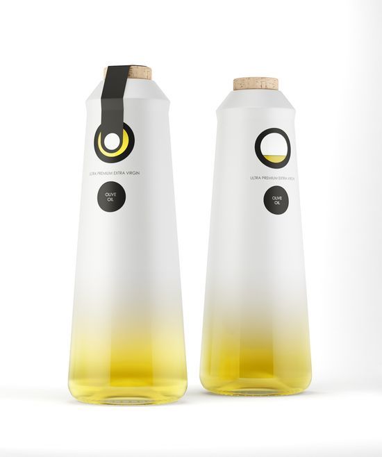
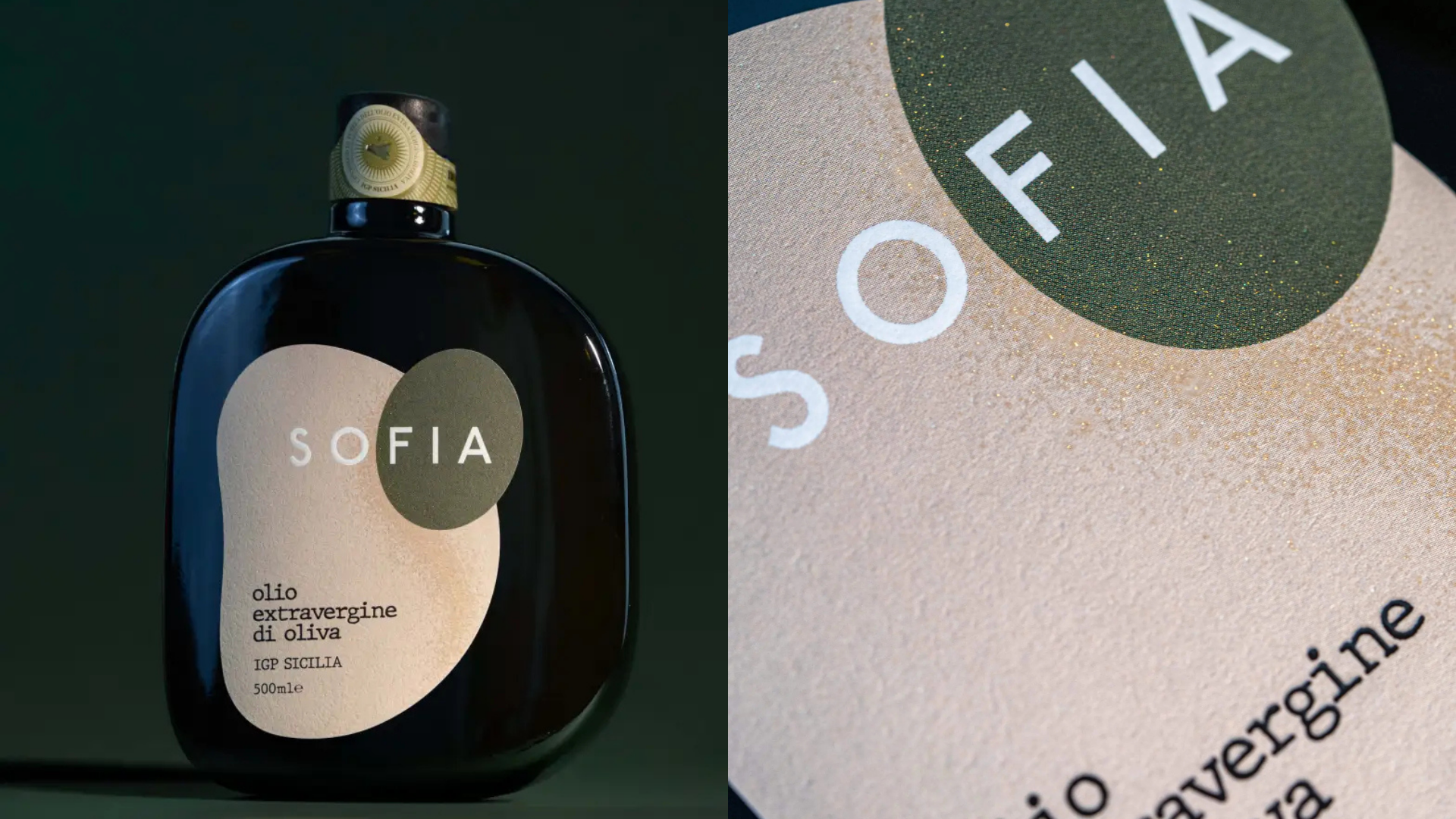
New concept from NT.GJ, a Lisbon based design firm.

“”O” borns from the desire of making a ultra premium olive oil brand that could easily be used in luxury restaurants, hotels and special dinners, without shocking with the interiors, using a simple name (“O” from olive) and really simple but elegant graphics.

The logo is a “O” with a hole on the middle from where you can see the color of the olive oil. The bottle is made by glass and painted with a gradient from white to transparent.

On the bottom you can see the olive oil clearly, in a beautiful and interesting visual effect. The cap is made by cork, giving a traditional and “hand made” feeling to the product.

This placeholder is removed when the ad slot is configured.

This placeholder is removed when the ad slot is configured.

This placeholder is removed when the ad slot is configured.

This placeholder is removed when the ad slot is configured.

This placeholder is removed when the ad slot is configured.

This placeholder is removed when the ad slot is configured.