Before & After: Schwinn Packaging

Published


CAP.Schwinn.BicycleTube_DL_small
CAP.Schwinn.FramePump_DL_small

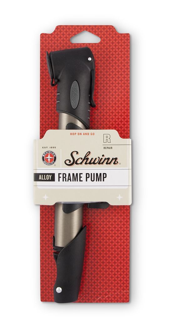
Capsule recently redesigned packaging for Schwinn that’s hitting the shelves of Target. The inside scoop behind the redesign:

“There aren’t many brands out there as classically
American as Schwinn. It evokes instant nostalgia, conjuring dreamy
childhood memories of adventures down suburban cul-de-sacs. As well as
the bicycles it is so well known for, Schwinn also sells a complete
range of parts and accessories.

Unfortunately, the packaging on these items
was letting the brand down, with its uninspiring look and feel. In
shades of grey, black and red and with little useful information for the
consumer, the packaging lacked personality. Capsule welcomed the
challenge, and we were excited to help the packaging reflect the brand’s
special kind of je ne sais quoi.

Planning any change to such a beloved
national icon must be carried out with extreme caution, since consumers
often don’t respond well to dramatic evolutions. Our design team began
by creating four mood boards, drawing inspiration from a huge variety of
sources, with each reflecting a very distinct look and feel. While it
can be difficult to articulate the more intangible aspects of a creative
vision, the mood boards enabled Schwinn to understand and spend time
with each possible direction.

Once packaging concepts were created,
Capsule tested these among consumers. We spent significant time with
each participant in the biking aisles to enable us to truly understand
the many factors affecting the purchasing process and the overall
experience in the aisle. We also came away with an astounding picture of
the perceptions of the Schwinn brand. It was compared with brand
behemoths like Coca-Cola and Levi, and that’s when we realized just how
much America loves Schwinn.

As the project moved into implementation, the sixty plus
products were carefully evaluated from a packaging standpoint to ensure
the use of environmentally friendly materials, reduced footprints, and
overall package durability. A consistent billboard effect was created
with the use of the Schwinn quality seal and script wordmark, color
palette, star pattern, and bold typography treatment. It leverages the
brand’s vibe of classic Americana with a contemporary spin on a
decidedly retro look. These brand elements create a strong presence in
the aisle and allow for easy navigation to find the product and features
the consumer is looking for.”

See two more photos and a “before” photo after the jump.

CAP.Schwinn.grip.front_DL_small
CAP.Schwinn.helm.front_DL_small
Genesbmxschwinntire03ck4

An example of the old packaging.

This placeholder is removed when the ad slot is configured.

This placeholder is removed when the ad slot is configured.

This placeholder is removed when the ad slot is configured.

This placeholder is removed when the ad slot is configured.

This placeholder is removed when the ad slot is configured.

This placeholder is removed when the ad slot is configured.