Search
Loading
Top Trending Posts
Newsletter
Featured Design Firm
FEATURED JOBS
« It's About Time. | Main | Highland Park 50 Year Old »
Wednesday
Oct062010

Honey Organic

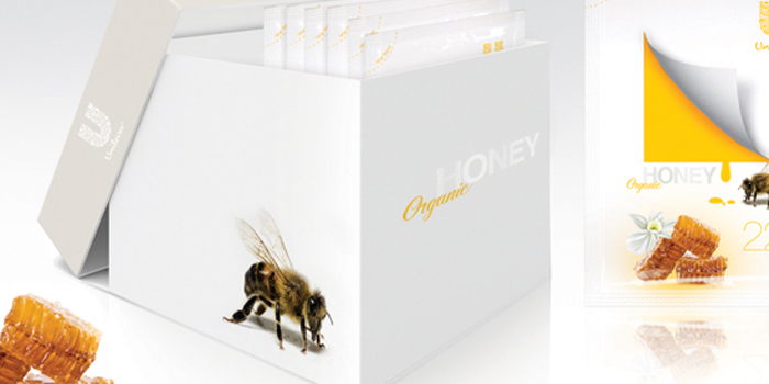
Brazilian designer Diego Aguilar designed this concept: Honey Organic.  More after the jump!

"This practice brings the package in pure organic honey sachets. Perfect for the breakfast, the kit contains 20 sachets, which will make your meal more healthy."


Reader Comments (9)

This product does not exist... Easy to make great designs when you don't have to worry about the client real needs, budget and sales results.
10.6.2010 | Unregistered CommenterDenis
Such a waste of paper... Not what I would expect from an organic product. I'd rather stick to the traditional glass jar.
10.6.2010 | Unregistered CommenterDenis
I believe honey is spelled wrong in the description ;)
10.6.2010 | Unregistered Commenterdesign
Organic has nothing to do with being green on the environment, i think this is awesome..
10.6.2010 | Unregistered CommenterSorry
I love it, it's simple and to the point, really sends the message. And yea there is nothing echo friendly in organic products, that's not the point.
10.6.2010 | Registered Commenterweronika zubek
I have to agree with the first comments. I think all products should think about environment, it doesn't matter if they are organic or not.. But really, what's the point of this discussion? This is not even a real product... or do you really believe Unilever would launch something like this? I'm not talking about "thinking out of the box" here. I really like new and inspiring ideas but the packaging, at the end of the day, is responsible to sell a product and to answer clients needs. Do you really think that a white box with honey written in spot varnish would do the trick? Only if this was a product sold on a luxury store... but certainly not something Unilever would do.
10.7.2010 | Unregistered CommenterBryan
I think there's potential with the peeling square icon, but it hasn't been made enough of - for example, there could be some clever way to combine the square graphic with the act of tearing the sachet.
There's too much happening - the photograph of the honeycomb feels out of place. Why are the weight and brand icon so big? Also, strange to use Unilever as the brand, since it's a massive corporation and would create an individual brand identity were it to launch a new product. The general placement of the elements on the sachet seems haphazard to me.
It might be true that organic does not necessarily have to mean environmentally considerate, but there is generally some correlation between the two - anyhow, this design is the complete opposite of environmentally friendly, serious overpackaging!
I don't really see the problem that this design hopes to solve. Honey might make your breakfast healthier but why does it need to come in a sachet?
10.7.2010 | Unregistered CommenterBen
I agree with Bryan and Ben. The three main arguments for using organic products are that they are a little more healthy, a little tastier and a little better for the environment -- now, while neither of those are true for all organic products, it does say something about what people expect. Making packaging that flies right in the face of one of these expectations can't be a good thing.

Also, the design makes me think someone thought "what would apple do" and then added a mess of too many unnecessary elements :l
10.7.2010 | Unregistered Commenterchrister
As a concept - I like it. It taps into an area of convenience and 'on the move'. Making honey (a very sticky product) accessible on the go. We all know the success of the pre-portioned oats and cereals. We can see the same behaviour in meals also ie: rice, ready meals etc, even a packet of crisps is a pre-portioned snack you can take with you.

Graphically, I fully agree - the illustration of the fold makes it appear quite artificial. I think a clever interaction between the bee and the window could like really appealing.

Environmentally - yes, slightly over-kill. Perhaps some recycled material could be used and talked about on pack. The outer pack appears like a rigid box but realistically it'll be a lighter paperboard or something.

I think it's a good idea for discussion. Some of the key elements need working on.
10.17.2010 | Unregistered CommenterWill

PostPost a New Comment

Enter your information below to add a new comment.
Author Email (optional):
Author URL (optional):
Post:
 
All HTML will be escaped. Hyperlinks will be created for URLs automatically.
Related Posts Plugin for WordPress, Blogger...