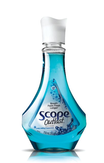
Webb Scarlett deVlam send us their newest work for Scope Outlast mouthwash packaging (structural design). The design’s main merit is in its structural form. This is probably the nicest-looking mouthwash bottle I’ve seen yet, and there’s a good reason for making it so. According to Christine McGovern, brand manager for Scope, studies have shown most consumers tend to put their mouthwash under their cabinet. If the bottle design is elevated, people would be more inclined to leave it out on the counter in full view so they’re more likely to use twice a day in their oral health regimen.
“We purposely put this product in a bottle that would speak to the consumer that this is something new and different. We really wanted to reinvent Scope with this,” said McGovern. “We are also trying to drive more consumption. One of the things we’ve learned is that consumers tend to put the bottle underneath their cabinet so if you want consumers to use the product twice a day as part of their routine if it is out of sight it could be out of mind. Having a bottle that is counter-worthy can help drive more usage and consumption to help bring those extra sales to the marketplace.”
Edited: Webb Scarlett deVlam handled structural design, while Landor is responsible for branding/design.