Search
Loading
Top Trending Posts
Newsletter
Featured Design Firm
FEATURED JOBS
« Vertuze Champagne | Main | Rise N' Shiner »
Thursday
Jul162009

Before & After: Breyers Ice Cream (updated)

Breyers  3715422684_97273cf98b_b
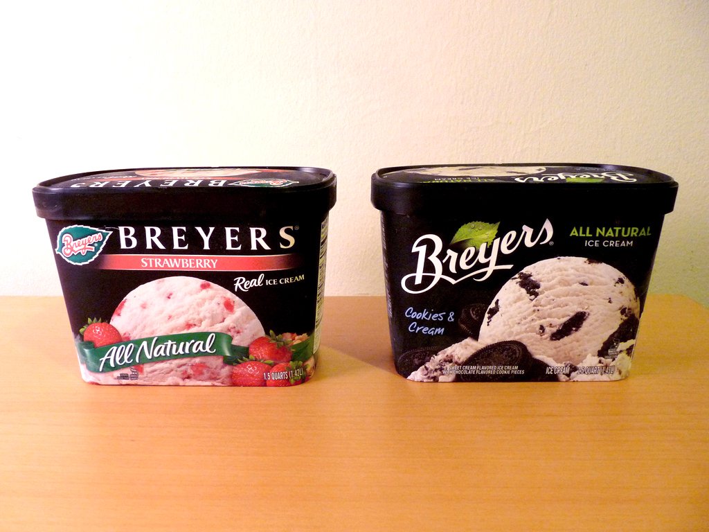
Photos by Karen Horton

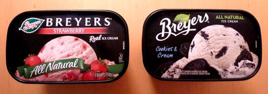
Breyers has recently redesigned their packaging and branding. Logo designed by Ian Brignell, Packaging by Sterling Brands. Sterling was kind enough to send us shots of the new packaging.

3715425870_c42e952a35_b

Reader Comments (22)

Unsure about this. I don't like the handwriting font used for the flavor. I don't mind the design, but it doesn't say "Breyers" to me. Hmm...
07.13.2009 | Unregistered CommenterJulie
I like it. I'm happy to see that they didn't run in the totally opposite direction of their previous design. A lot of people seem to think that "redesign" means "kill of what's already established and familiar". Not always the case.
07.13.2009 | Unregistered CommenterGabrielle
there is a bit more info on the Breyers brand history and new design on original post on re:designrelated, but they also didn't track down the agency responsible, and an example of the very first example of the Breyers logo http://redesignrelated.com/post/140484121/breyers-ice-cream-brand-redesign-it-was-an
07.13.2009 | Unregistered Commentersteve
Breyers is one of the few ice cream brands that is "all natural". This major selling/branding advantage has been trivialised in the redesign.
07.13.2009 | Unregistered Commenterjames Smith
I know Smith Design has had them as a client, though I'm not sure they are responsible for the redesign.
07.13.2009 | Unregistered Commenterstephanie hiser
Overall, I'm liking this design. The composition seems a bit more dynamic with the cropped in shot of icecream being the hero. I REALLY like the reinvigorated use of the leaf breyers logo, bringing the name outside of the leaf. The realistic leaf rendering also helps add to the 'natural' feel.

The one thing i don't like is the handwriting font used on the flavor.

Great job overall though. I need to go pick up some Rocky Road now....
07.13.2009 | Unregistered CommenterJason
Really nice redesign - everything is improved.

Kept the existing equity and freshened it up!
07.13.2009 | Unregistered CommenterCraig
I saw this in the supermarket over the weekend. Not a huge fan overall. Some SKUs look nearly identical with the only differentiation being the flavor name (which you have to be close to read). I do like the Breyers logo redesign though.
07.13.2009 | Unregistered CommenterHolden Caulfield
It's nice work, but for me personally I like the ice cream scoop centered.
07.13.2009 | Unregistered CommenterJohn
Woohoo! They got rid of the traditional ribbon! Thank you Sterling, for trying to get away from the "Every-Food-Package-Needs-A-Ribbon/Banner" aesthetic :) It is much appreciated.
07.13.2009 | Unregistered CommenterMelissa
I'm happy with this redesign - they've kept in line with what was previously established and just removed the double-ups (such as 'Breyers' being repeated twice and 'All Natural'/'Real ice cream' being repeated). It definitely looks a lot cleaner and more interesting to me.

I'd be curious to see a strawberry next to a strawberry, though.
07.13.2009 | Unregistered CommenterPauline
I don't think the new packaging is an improvement. The new leaf with the water droplets looks like it belongs on a beverage rather than ice cream. Is it melting? Also, this now removes the Breyers logo which has been their image for as long as I can remember. A quick glance makes you think it is a private label instead of the name brand.
07.14.2009 | Unregistered CommenterJJ
The new look is cleaner which is nice. I don't mind the friendlier logo either... though i don't love it, it seems like a good idea, not the best execution.

The problem i have is with the light version. The blue is awful and looks dated. And across the entire line (i can't believe i am saying this as a designer) the flavor names are TOO small!
07.14.2009 | Unregistered CommenterTC
The leaf looks minty and is wet....that could be a big a mistake in communication sincewater droplets on ice cream cues melting... not ideal especially in the freezer case and on a brand whose texture tends to be more 'icy' and less 'creamy' than the super premium all-naturals. The larger scoop is nice but the All Natural claim has been minimized and does not sync with Breyers long-standing equity of being the 'all Natural' ice cream. The blue version seems artificial.The positive aspect is the branding is larger.
07.15.2009 | Unregistered Commenterart beauty
nicer aesthetic and i like that there is more hierarchy, although the architecture doesn't address the flavor names very well at all—making it tougher to shop.
07.15.2009 | Unregistered Commenterdrew
Drew - the smaller flavor name makes it tougher to shop?

So the large, full color ice cream photos of Vanilla, Strawberry and Rocky Road do NOTHING to assist you?
07.16.2009 | Unregistered CommenterCraig
This went through rounds of consumer validation before being launched to shelf. All this criticizing for the sake of doing so, is ridiculous. Either you like it or you don't!
07.16.2009 | Unregistered Commenter®
Designers can't just like it or not. It is our nature to critique and improve.re: consumer validation comment....that entire industry and model should be in question. The only validation is: will people pick it up and buy it? Analyzing consumer validation results can lead to a black hole of pseudo science.. Surely, Tropicana was validated by consumer testing of some sort. Brands should rely more on common sense and gut feel. Imagine the money and brands that could be saved.
07.17.2009 | Unregistered Commenter
I like the way the new logo mimicks the roundness of the ice cream scoop. I'm not a fan of the typeface used for the flavor. To me its handwritten nature is fighting against the hard scriptic logo. It is smaller and a bit harder to read. I'll have to see the product on the shelf in the real world to really have a true opinion about it. But I do like the logo and I'm also glad to see the "ribbons" gone.

07.17.2009 | Unregistered CommenterHolly
Wow, (being a designer myself) I think sometimes we OVERTHINK design a tad. "The leaf is wet therefore I'm to believe my ice cream is melting?" "The all natural has been trivialised because it's not in 92 point type?"

I saw these in the store way before seeing this post, and was very impressed with the new look. It actually feels "more green/eco/all-natural" to me, and I think it's simply because of the crisp, bright green leaf, and the All Natural being in green against the bold black. It's very fresh! I liked it a lot!

I do agree with everyone though, the "handwritten" flavor font was a really bad choice.

Mmm... I love me some Breyers!
07.17.2009 | Unregistered CommenterNathan
I think I'm in the minority when I say I like the handwriting font for the flavor. It adds a dimension of real that is obviously the intent on this new packaging. And, I don't mind that it's so small, considering the photo is gigantic and quite obviously indicating what is the flavor.

Also, wow, sometimes yall over-think things. Is the leaf melting? Jeez. Just sit back and admire how absolutely sexy is that green leaf. C'mon, maybe yall are just a little jealous? I know I am.

I'd love to see side/back panels, to see how their very important-looking sans serif font plays out. I know it, I just can't think of the name.

Is there anything I don't like about the redesign? Yes, the Smooth & Creamy swirl of color. I'm not sure what would be a better solution, but the color is taking up valuable black real estate, something that's definitely part of the Breyer's brand. Also, on the Smooth & Creamy line, they've substituted "Extra Creamy" for "Ice Cream," and that just doesn't seem right. Not to mention the underwhelming font choice for it.

All that aside, I do like the (customized?) script for the actual Smooth & Creamy line. I just wish that swirl was gone.
07.18.2009 | Unregistered CommenterJohn Mindiola III
why does the lettering artist who was commissioned and briefed how to execute the logotype get a credit for designing it? the designer who art directed him should get that credit as the person orchestrating the entire redesign. the logo was commissioned as part of that specific concept's hierarchy of elements. seems odd that the credit is split. that entire pack was designed by sterling. the end. congrats to simon lince, steph krompier and their team.. its a beautiful new evolution of a category leading brand.. a very easy thing to be critical of here on a blog, but a very difficult thing to actually execute. (ask peter arnell)
07.24.2009 | Unregistered Commenterdan

PostPost a New Comment

Enter your information below to add a new comment.
Author Email (optional):
Author URL (optional):
Post:
 
All HTML will be escaped. Hyperlinks will be created for URLs automatically.
Related Posts Plugin for WordPress, Blogger...