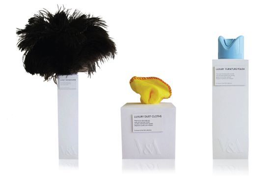
“The idea was that the products became a sculpture and the packaging supported that idea by being the plinth that the sculptures are displayed on in the gallery. My influence for the type i designed was from the little plaque you get next to paintings in the galleries. I decided to deboss the v&a logo into the pack to keep the purity of the white space and keep the idea looking smart and simple.”
The idea was to take a product and create a company that would sell local produce and be eco friendly. I designed a pack that would be a wrapper made from brown paper which is a 100% biodegradable and the label would be backed with glue so it sticks the whole pack together. Each label had an arguement about why you shouldn’t buy meat from the supermarket. Then under that there is the reason why you should buy british and local meat.