(Photos © Davis Design)
Davis Design was recently hired to revitalize the Shredded Wheat Cereal line – which had become inconsistent, cluttered and non-descript. Shelf impact was minimal, and the brand looked dated and generic.
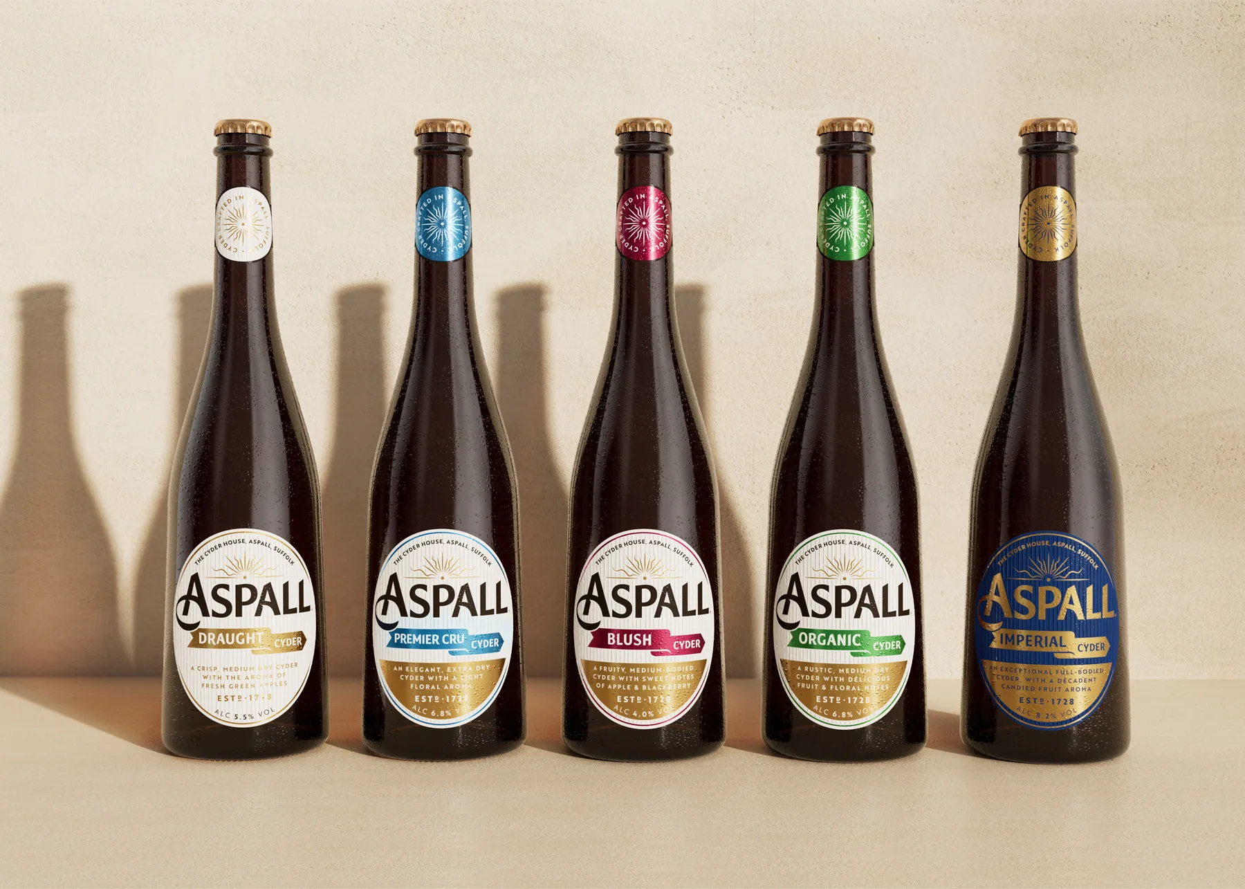
The new design is bright and fresh and really hero’s the product. It looks contemporary, but the type still feels crafted and authentic. I love how all the elements align, even on packaging of different sizes. Very nice. The new line now creates serious shelf impact.
According to Davis Design:
“Minimizing on-pack communication points instantly focuses attention to the brand, product name and flavor variety. Refined typefaces and simplified images ensure easier recognition and selection on shelf. Retaining previously established variety colors ensures that packaging remains recognizable to traditional purchasers, but appears contemporary enough to attract new consumers.”

