Search
Loading
Newsletter
Latest Post:
Featured Jobs
Featured Firm

View All
Add Listing
« lite2go | Main | Hanger One ‘Alchemist Series’ »
Tuesday
Mar312009

Before & After: Bath and Body Works

After

  
PBBW1-4966221dt

Before

111307-bbw

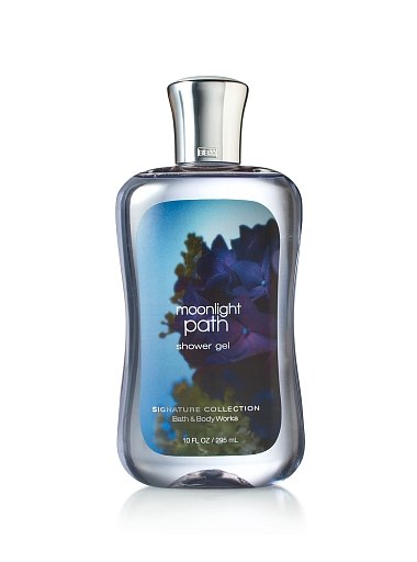
I saw the new packaging for Bath and Body Works signature line a few weeks ago when I was out shopping and wrote them to inquire about the redesign.

This is what they had to say:

"The Signature Collection restage launched in 400 stores in the Eastern half of the United States and rolled nationwide in early February. This preliminary launch helped us test and learn to roll out the remaining 1200 stores successfully.

This relaunch has improved the perception of Bath and Body Works through more sophisticated packaging, improved formulas and new and improved in-store marketing and navigation."


A few more after the jump.

Shot43_small_wmShot48_small_wm

Shot58_nopink_wm_small

Shot4142_v1_small_wm

PrintView Printer Friendly Version

EmailEmail Article to Friend

Reader Comments (12)

With so many bubbles, you cant really see any of the art
March 31, 2009 | Unregistered Commenteraks
I like it, but I'll miss the old design.
March 31, 2009 | Unregistered Commentersnow
yeah... can we see some images sans bubbles? it's hard to judge a design you can't see.
March 31, 2009 | Unregistered Commenterjohn.q
I just updated the post with an image without bubbles.
March 31, 2009 | Unregistered CommenterRachel Dunagan
The new bottle shape is quite...sexy. Great improvement, much more compelling through saturated/dark visuals and sexier photography.
March 31, 2009 | Unregistered CommenterBrian Son
I've seen these in person and the new chrome cap looks cheap and tacky. Bottle shape as well as the photography are much improved, but something about the label size or shape is off. Too big, or maybe it simply doesn't fit the bottle well? Overall, I feel like some aspect of the B&BW brand has been lost. These seem like they'd be more at home in a Target.
March 31, 2009 | Unregistered CommenterLindsey
I'd like to see this in person. I agree with Snow, to a degree. B&BW to me is nostalgic, a throw back to my preteen years. In those days, B&BW products had a warm country, southern comfort (not the liquor) look about them. Not that those designs would still work today, but I miss those days!
April 3, 2009 | Unregistered CommenterMelissa Klotz
Any word on who did these? I think they're an amazing improvement much more sophisticated & easy to identify.
April 6, 2009 | Unregistered CommenterAdam
Ugh! I don't like the redesign... I saw them in person last week, looked cheap...
April 29, 2009 | Unregistered CommenterJin
Anomatic Corporation provided the metal closure.
May 29, 2009 | Unregistered CommenterSteven
I like the new design.I got these as a gift and if I had gotten the old style I don't think I would have felt "these are special".When I look at the moonlight path bottles in my bathroom, I imagine going for a moonlit walk and it feels relaxing. Breathing in summer flowers. Mysterious and sexy.
June 6, 2009 | Unregistered Commenteranony mice
I would like to compliment teh packaging at Bath and Body Works and ask the packaging team leader a few questions. How can I reach that individual?
August 17, 2010 | Unregistered CommenterJT Harvey Jr

PostPost a New Comment

Enter your information below to add a new comment.
Author Email (optional):
Author URL (optional):
Post:
 
All HTML will be escaped. Hyperlinks will be created for URLs automatically.